Launched in 2016, the employee-owned THC Design had cultivated something that is hard-earned in the world of cannabis—trust. While they had steadily built a strong, dependable reputation in a hazy, over-crowded industry full of thirsty players, almost-rans, and heady newcomers, they knew they had to solidify their status as a legacy California brand.
What’s more, they had national ambitions, and we knew the right voice could help lay the groundwork for longevity, positioning THC Design as the next Great American Cannabis Company.
Our goal was to take something as culturally complex and regulated as cannabis and build a brand that evokes the trust and resonance of companies like Levi's or Nike. But they also needed a voice to match, one that felt lasting and confident, something with character that would make the brand distinct. The cannabis world is full of players that fizzle out from the gate, but here was a real brand with a premium product and genuine diehard followers.
We avoided the trap of leaning too hard on California tropes. Sunshine, surfboards, and localized slang are familiar, but limiting. Instead, we looked to timeless, unforced, and quietly powerful brand language. We worked closely with writer Mennlay Golokeh Aggrey, whose background as both a cannabis cultivator and storyteller brought rare depth to the project. Her straightforward and intentional language helped articulate that THC Design is a brand that values people, product, and purpose in equal measure.
That kind of restraint was key, especially in a market still defined by regulatory uncertainty and cultural contradiction. When so much is out of your control (federal policy, banking access, distribution pipelines), your voice becomes a rare fixed asset. It's something you can control. And for THC Design, it became an anchor. Projecting that kind of confidence often brushes up against stoner tropes and the hazy visual language of the category. But here, voice became a strategic tool: a piece of ownable brand equity that helped the company stand apart while steering clear of cannabis clichés. In a space where consistency is rare, reliability was everything.
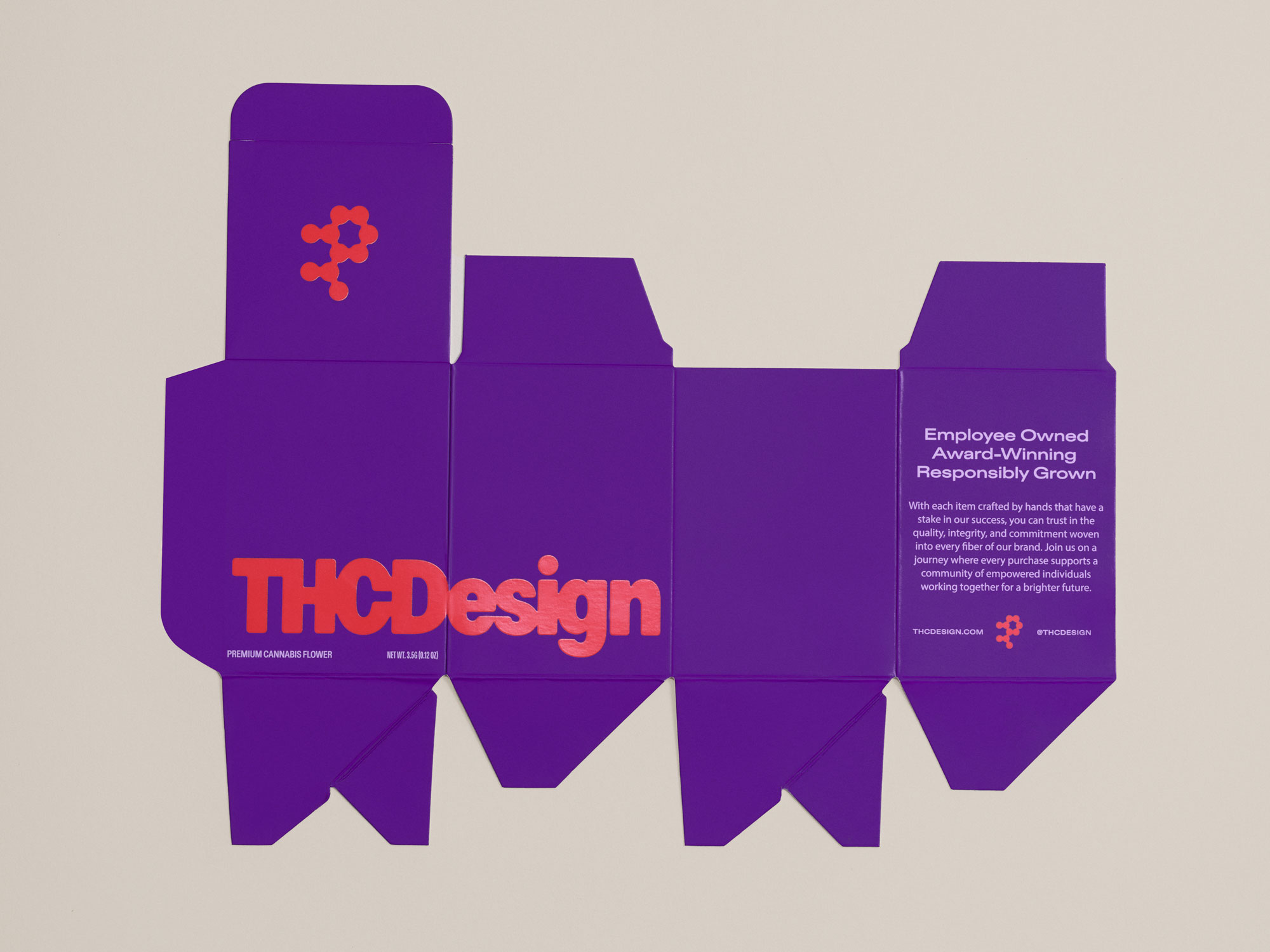
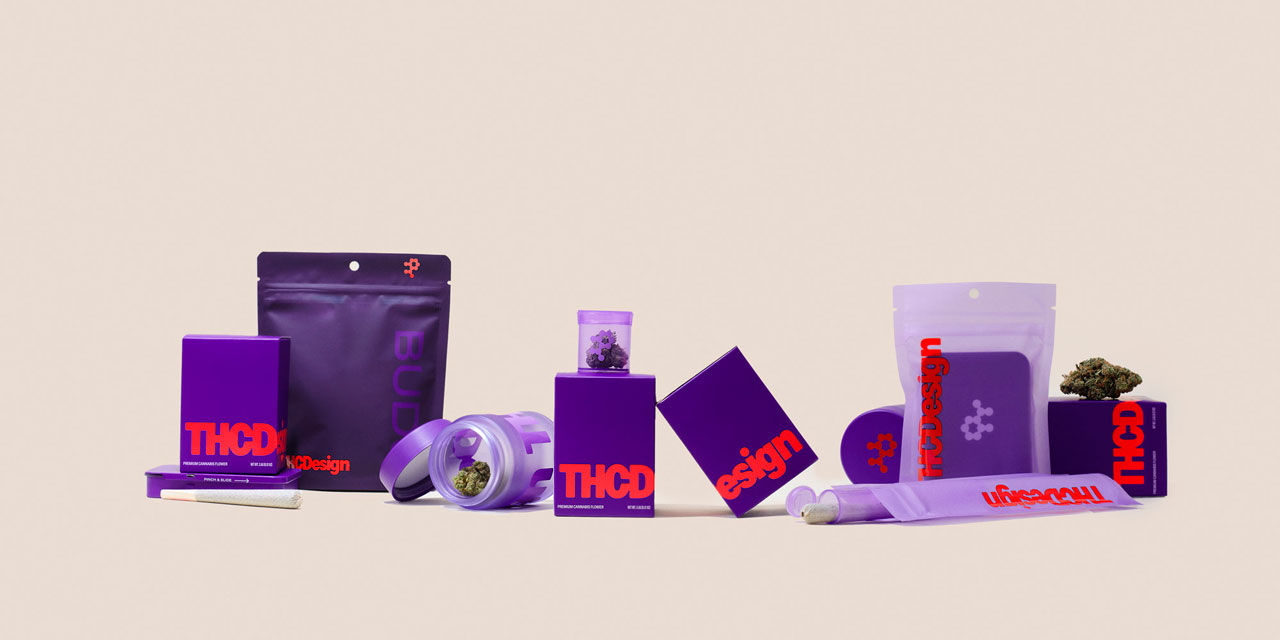
The tone we established also needed to function across a patchwork of regulatory landscapes. That's where design and copy began to inform each other. What started as a cost-efficient packaging system, one layout adaptable to various state requirements, became a powerful brand storytelling tool. We used it to communicate strain education, terpene profiles, and even visual narratives through a modular "bento box" structure. The voice extended into this framework, adding clarity and cohesion wherever it appeared.
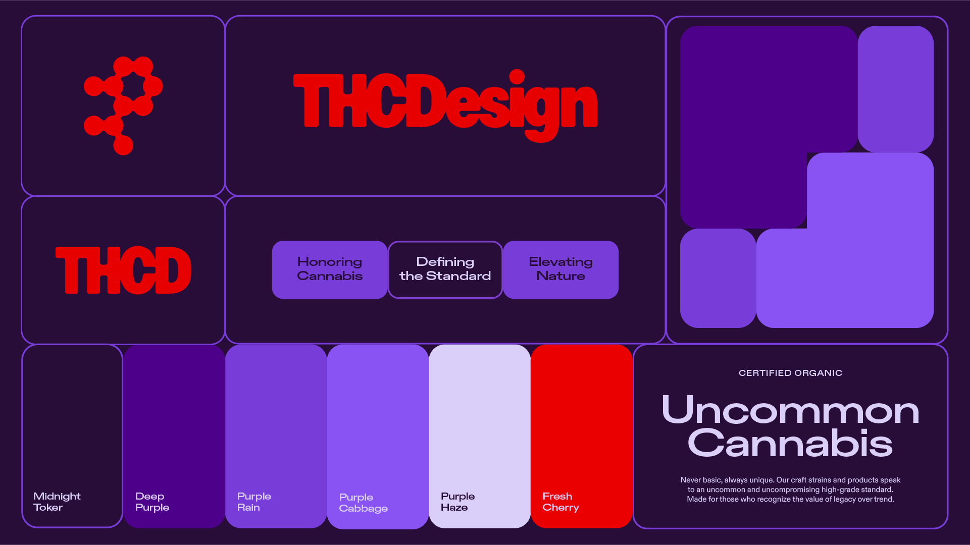
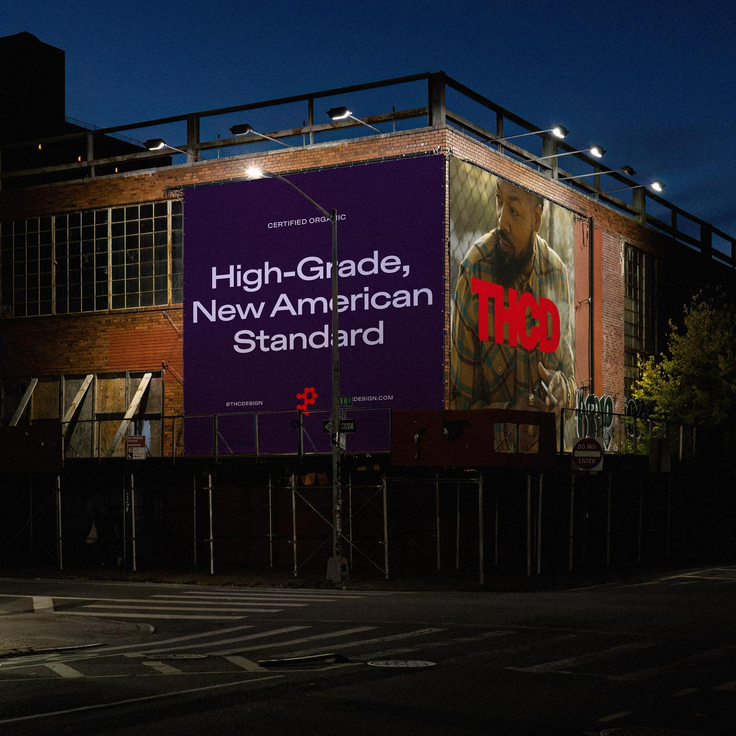
Key to this voice were phrases like "High Grade, New American Standard," a confident, declarative tagline that positioned the brand alongside heritage American icons like Levi's or Nike. It spoke to both craft and scale, suggesting tradition and trustworthiness while signaling a new cultural moment for cannabis.
Similarly, "Uncommon Cannabis" evoked a sense of rarity, discernment, and a break from the mainstream. It stood out on shelves crowded with noisy, jargon-heavy competitors.
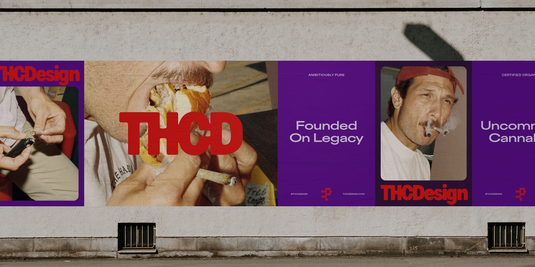
Lines like "Never basic, always unique," "Made for those who recognize the value of legacy over trend," or "Founded on Legacy" anchored THC Design in authenticity and experience. At the heart of it all was also the core brand ethos: "We are a collective of values-driven, flower-forward growers, innovators, workers, veterans, creators, and leaders who never compromise on quality." That mission statement was a proclamation underscoring the brand's inclusivity and integrity, while connecting modern consumers to the plant's deep roots and the growers who have shaped its evolution.
Together, these lines created a verbal identity that was flexible but never vague, premium but never elitist, and spoke to an audience who sees through hype and seeks a deeper meaning in what they consume.
And it's working. As THC Design expands into states like Nevada, the verbal identity is doing what it was built to do: creating familiarity in unfamiliar places, building trust with retailers and customers, and giving the internal team a shared sense of who they are and where they're going.
THC Design has weathered the volatility of a market still caught between legal ambiguity and cultural change. They're expanding with purpose, and with a clear verbal identity, they're equipped to speak to new markets with the same authority that built their name in California. Our role was to reveal the brand voice that had always been there and help shape it into something with the muscle and clarity of a true American original.
With nearly twenty years of experience Anthony Cappetta is passionate about building visceral, niche brands that resonate beyond culture and traditional demographics. Anthony's career began in the Minneapolis advertising scene before moving to NYC, where he spent a decade sharpening his craft and refining his creative direction at renowned agencies such as Chandelier Creative and Jones Knowles Ritchie.
CREDITS
Super Okay
Creative Director - Anthony Cappetta
Strategy Director - Geoff Rynex
Copy Director - Mennlay Golokeh Aggrey
Senior Designer - Mia Le
Designer - Chris Von Burske
Account Director - Rob Hubbert
Project Manager - Cassandra Powell
Launched in 2016, the employee-owned THC Design had cultivated something that is hard-earned in the world of cannabis—trust. While they had steadily built a strong, dependable reputation in a hazy, over-crowded industry full of thirsty players, almost-rans, and heady newcomers, they knew they had to solidify their status as a legacy California brand.
What’s more, they had national ambitions, and we knew the right voice could help lay the groundwork for longevity, positioning THC Design as the next Great American Cannabis Company.
Our goal was to take something as culturally complex and regulated as cannabis and build a brand that evokes the trust and resonance of companies like Levi's or Nike. But they also needed a voice to match, one that felt lasting and confident, something with character that would make the brand distinct. The cannabis world is full of players that fizzle out from the gate, but here was a real brand with a premium product and genuine diehard followers.
We avoided the trap of leaning too hard on California tropes. Sunshine, surfboards, and localized slang are familiar, but limiting. Instead, we looked to timeless, unforced, and quietly powerful brand language. We worked closely with writer Mennlay Golokeh Aggrey, whose background as both a cannabis cultivator and storyteller brought rare depth to the project. Her straightforward and intentional language helped articulate that THC Design is a brand that values people, product, and purpose in equal measure.
That kind of restraint was key, especially in a market still defined by regulatory uncertainty and cultural contradiction. When so much is out of your control (federal policy, banking access, distribution pipelines), your voice becomes a rare fixed asset. It's something you can control. And for THC Design, it became an anchor. Projecting that kind of confidence often brushes up against stoner tropes and the hazy visual language of the category. But here, voice became a strategic tool: a piece of ownable brand equity that helped the company stand apart while steering clear of cannabis clichés. In a space where consistency is rare, reliability was everything.
The tone we established also needed to function across a patchwork of regulatory landscapes. That's where design and copy began to inform each other. What started as a cost-efficient packaging system, one layout adaptable to various state requirements, became a powerful brand storytelling tool. We used it to communicate strain education, terpene profiles, and even visual narratives through a modular "bento box" structure. The voice extended into this framework, adding clarity and cohesion wherever it appeared.
Key to this voice were phrases like "High Grade, New American Standard," a confident, declarative tagline that positioned the brand alongside heritage American icons like Levi's or Nike. It spoke to both craft and scale, suggesting tradition and trustworthiness while signaling a new cultural moment for cannabis.
Similarly, "Uncommon Cannabis" evoked a sense of rarity, discernment, and a break from the mainstream. It stood out on shelves crowded with noisy, jargon-heavy competitors.
Lines like "Never basic, always unique," "Made for those who recognize the value of legacy over trend," or "Founded on Legacy" anchored THC Design in authenticity and experience. At the heart of it all was also the core brand ethos: "We are a collective of values-driven, flower-forward growers, innovators, workers, veterans, creators, and leaders who never compromise on quality." That mission statement was a proclamation underscoring the brand's inclusivity and integrity, while connecting modern consumers to the plant's deep roots and the growers who have shaped its evolution.
Together, these lines created a verbal identity that was flexible but never vague, premium but never elitist, and spoke to an audience who sees through hype and seeks a deeper meaning in what they consume.
And it's working. As THC Design expands into states like Nevada, the verbal identity is doing what it was built to do: creating familiarity in unfamiliar places, building trust with retailers and customers, and giving the internal team a shared sense of who they are and where they're going.
THC Design has weathered the volatility of a market still caught between legal ambiguity and cultural change. They're expanding with purpose, and with a clear verbal identity, they're equipped to speak to new markets with the same authority that built their name in California. Our role was to reveal the brand voice that had always been there and help shape it into something with the muscle and clarity of a true American original.
With nearly twenty years of experience Anthony Cappetta is passionate about building visceral, niche brands that resonate beyond culture and traditional demographics. Anthony's career began in the Minneapolis advertising scene before moving to NYC, where he spent a decade sharpening his craft and refining his creative direction at renowned agencies such as Chandelier Creative and Jones Knowles Ritchie.
CREDITS
Super Okay
Creative Director - Anthony Cappetta
Strategy Director - Geoff Rynex
Copy Director - Mennlay Golokeh Aggrey
Senior Designer - Mia Le
Designer - Chris Von Burske
Account Director - Rob Hubbert
Project Manager - Cassandra Powell
Further Reading


