Every four years, a few billion people watch the World Cup and the Olympics. How many of them ever stop to wonder who decided what it would all look like, or that those decisions were made years before the first whistle? Chris Braden, co-founder and CCO of Public Address, is one of the people behind this year's World Cup identity and the LA28 Olympics and Paralympics, brands that have to be built for a moment that doesn't exist yet and still feel right when it arrives. He tells us what it actually takes to brand the biggest moments in sport, why he designs for change, and what it’s like to watch a much-maligned logo end up tattooed on Marc Cucurella.
Where are you from? Where do you live?
I grew up just outside Toronto and now live in the middle of it, in a house built the same year Canada became a country. Our studio is a three-minute walk away, which I stretch to ten with a coffee.
What was the path like to where you are today? Was it always your intention to work on global sporting brands from the start of your career, or a happy accident?
I grew up playing a lot of hockey — still five days a week through my first year of design school at OCAD University. Doing both wasn’t sustainable, so after my first year at university I picked design. At the time, they felt like two totally different worlds, that they finally merged is a pleasant surprise.
Looking back, sport was the entry point into design. I’m sure I cared more about team colours, logos on sticks, and team crests than most kids playing hockey. My notebooks were full of Maple Leafs logo sketches — a love that remains unrequited.
After graduating from OCAD U, I started working at Bruce Mau Design (at the time, my dream job). While there, I had the unique opportunity to work on the identity for the school I just left (at the time, my dream project).
Years later, I thought I’d given up sports to go to OCAD, but strangely enough, the work I did for OCAD is exactly what got me back into sports. The lessons of what makes variable identity systems work came back to me through the ever-evolving design systems for the LA28 Olympics and Paralympics.
Over the years and with some great partners like LA28, FIFA, ASICS, Utah 2034, and the Brooklyn Nets I’ve been lucky enough that sport and design have continually crossed paths.
Tell us about the process behind creating the 2026 World Cup identity. Did you interview players and/or fans to get a sense of the energy of the moment? Do you rely on history?
A tournament identity plays a unique role in the overall experience of the event. It’s more like setting the stage than writing the script. It’s equal parts expression and infrastructure.
For the FIFA World Cup, the players and their nations are the stars. The brand needs to create the connective tissue that brings all the amazing moments together into something memorable. What makes events at this scale so interesting and challenging is that there are many narratives happening simultaneously, across different countries and cities. What we’ve realized is a single monolithic approach to the brand doesn’t work, you really need a dynamic system. Beyond the aesthetic challenge, there are complex structural and commercial needs that shape the overall approach.
We definitely look at history – of the event and the hosts – as we figure out the direction. But we also look to the future. Identities like these are often designed many years before the event, so you have to push the boundaries even more to make sure it feels exciting and new when it does finally kick off.
As you can imagine, there are many people and partners involved in creating an event at this scale — each bringing their own expertise, experience, and perspective that help shape the final result.
How do you craft a brand story for a decade-away moment, and what keeps that story from feeling dated by the time it launches?
The real question is why we aren’t always designing a decade out?
The reality is, guessing what will be relevant creates a high probability that you’re going to be wrong. Instead, we design identities that acknowledge and embrace the fact that change is inevitable. Flexibility becomes a resilience strategy.
Our goal isn’t to make sure the brand looks the same from the day it’s revealed to the moment the event closes. We create systems that build momentum alongside the brand. Our first conversation with LA28 was a warning where we said: “If anyone tells you they can predict what your identity should look like a decade in advance, don’t hire them.”
People invest in their branding because they want their organization to grow (in size, reach, impact). If the brand itself doesn’t embrace change, it’s inherently opposed to the goal they hired you for.
What are the challenges of building a brand narrative for a global event where the “audience” is the entire world?
A single brand expression or narrative can’t connect with everyone. We’ve found if you make it your goal to design for everyone at once, you end up with a solution that is palatable but lacks passion. In some parts of life, a compromise is the solution, in brand design, a compromise is just a compromise.
So, instead of one solution for everyone, we aim for a system that can flex. Still recognizable, but adapted to different audiences.
We spent years working with Netflix developing identities for different taste communities so that as a brand, they weren’t showing up as one monolithic corporate brand. They looked different when they were communicating with kids, or talking about films, or food, or sci-fi. But each genre, or audience specific expression, started with what was familiar: The Netflix Sans, Red, The N icon. As a brand, it was recognizable, but in its flexibility it became relevant.
With the FIFA World Cup, there were variations based on host countries, host cities, participating nations, price points, media, volunteers, to name a few. They all followed the same system and were built from a shared collection of design elements, but each one flexed the core identity to connect with a specific audience or need.
The LA28 logo system follows a similar strategy. The variable ‘A’ allows the core identity to integrate styles, people, and stories with specific audiences in mind.
How do you tell a global story without becoming overwhelmed by politics and identity? What angles do you play to and which ones do you avoid?
When you combine sports and place, people get emotional because they both tap into deeply rooted senses of identity. Events like the World Cup and the Olympics have a fine line to walk, they need to be something that represents the hosts, but also something that feels welcoming and unifying to all the participants.
As these events continue to grow, they have the added challenge of multiple hosts. In the FIFA Women’s World Cup 2023 it was Australia and New Zealand. WC26 had the added challenge of not only 3 countries — with very different landscapes, cultures, and even languages —but also 16 host cities, all of which are world-class and have identities of their own.
In WWC23 we partnered with local aboriginal women artists and commissioned artwork that we incorporated into the identity. We avoided traditional national symbols like the flags, which can be contested symbols, and ones whose meaning is out of our control.
The WC26 brand looked to the host cities to inspire a flexible system that allowed for each to have their own look as part of a unified moment. The result is something that felt celebratory and welcoming in a way that — given the political moment – the approach to the ‘94 World Cup would have failed (even though it’s a beautiful logo and was right for its time).
In LA28, you can see a logo and system that is much more about the people and place compared to the ‘stars in motion’ identity the last time it hosted in ‘84 (again, beautiful logo, and perfect for its time).
The increased scale, timeframes, and speed of political change mean events like these can’t rely on the borrowed meaning of national symbols. Instead, we need to create symbols whose meaning we can define and control.
Were there any surprises in terms of audience response to this year’s World Cup? Any fun or interesting anecdotes about this project that people would be surprised to hear?
Admittedly, first reactions to the logo when it launched were pretty rough. It was a new approach for an event and organization people have a lot of feelings about. Seeing the general opinion shift as the event came to life and people got to see not just the symbol, but the system was great. We got to see the identity come to life in LEGO and even tattooed on Marc Cucurella.
When we work on identities, we always do mock-ups to show the potential of the system. Every day we were surprised to see it pop up in a place we had never considered – from a Canadian dollar coin to the International Space Station. Surreal, to say the least.
What’s something people dramatically underestimate about branding global events?
There is a staggering number of people involved in bringing these events to life. For a lot of organizations at this level, these are crucial to their success as major revenue is on a 4 year cycle. That has the potential to lead to risk-averse decision making. These are wildly complex and challenging events to pull off. Any organization willing to push the boundaries on their identity and try new things on top of that should be commended.
Outside of the project itself, you have no idea what global events might impact how the event or brand is perceived. Between when a project was briefed and the opening ceremonies, there has been a global pandemic, multiple elections, wars, and the rise of AI. You can’t predict the future, but you can design for it.
When you look back on a project a decade later, what tells you it was successful?
In a lot of ways, the identities for events like these are only as good as the memories people have. I think the most successful ones are able to capture a moment in time. Personally, I think the brands that feel like they started a new era are the most exciting. London 2012 felt like a distinct moment – probably why it was so controversial. The hope is that it feels like nothing that came before it, and inspires more future events not to copy them, but to continue pushing the boundaries.
Most brands are trying to create relevance today. Your work has to feel relevant years before it exists. Has working on those timelines changed the way you think about trends altogether?
It’s impacted how we approach every project. It made us realize how short-term most brand design is – it shouldn’t be radical to design for a decade in the future.
Typically, brands are designed for consistency, but we design for change. This makes brands not only resilient to external forces, but also inspires growth internally. Over all the years we’ve been doing this, we’ve never been hired to keep things the same.
We’re lucky enough to work with some partners who are giving us the opportunity to really push the timeframes we are designing for. There is a university that we’re working with to design a brand that will help them achieve their 50-year goals. With MGM Studios, we were looking at how to build a brand for their next century. With Gallo, we were challenged to think on the scale of generations.
What we know is true with all those organizations is they don’t expect to be in the same place for long. Our job isn’t to predict exactly what the world – or even their brand – will look like, but instead give them the tools to grow their recognition and relevance. It’s not about ignoring and fighting against more shortsighted trends; it’s about having the system to not lose yourself in them.
Bonus Round
What’s one creative hill you’ll happily die on?
People who “fix” logos online are only advertising how little they know about what it takes to make one real.
A reference you’re currently obsessed with?
The 5 Obstructions (A film by Lars von Trier and Jørgen Leth)
What’s the best piece of writing you read recently?
A list of Japanese onomatopoeia.
Describe your dream brief in 10 words or less.
Design Canada.
Write your personal tagline (5 words or less).
The Right Kind of Wrong.
About Chris
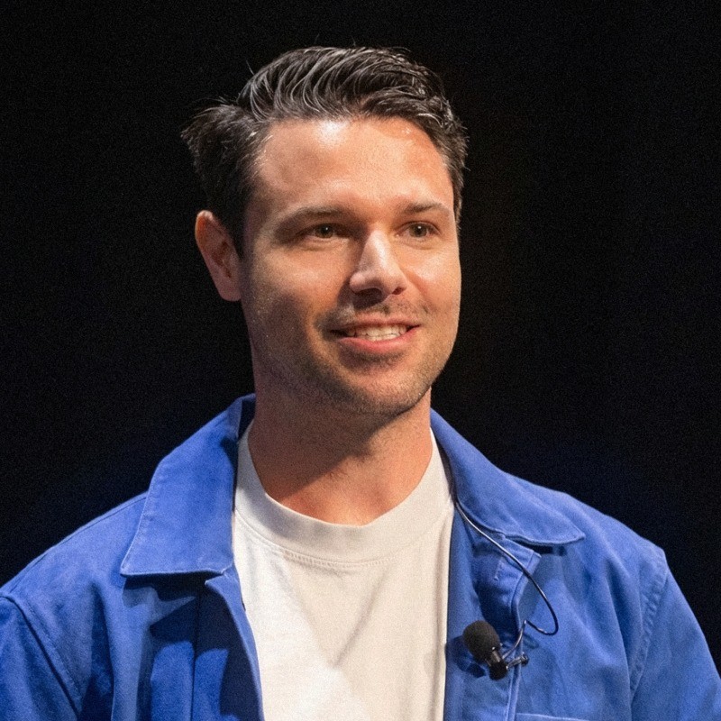
Chris Braden is co-founder and CCO of Public Address. He works with international partners to start-up, scale-up, and shake-up global brands.
Further Reading