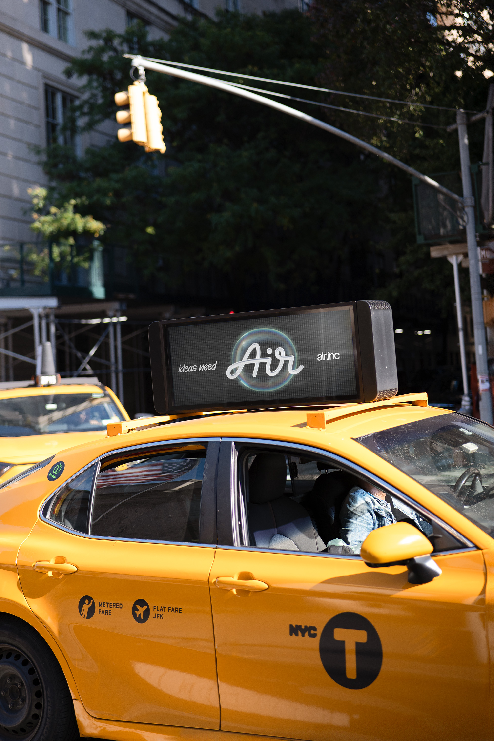
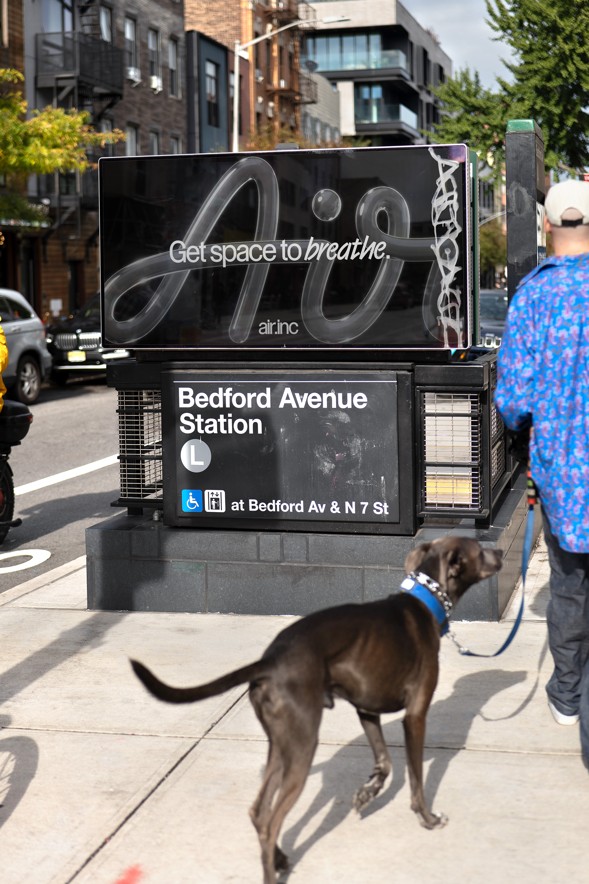
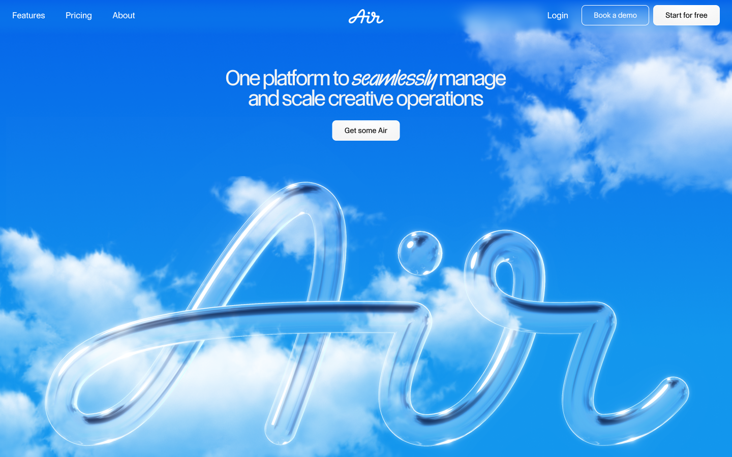
Air’s rebrand caught our attention for its movement, flow, and the way it seemed to live among its audience both in the design and the words. We spoke with Richard Turley, Co-Founder and Creative Director at Food, and Kate Baker, Creative Director, to learn how the rebrand came to life through a creative workflow that helped shape Air’s voice and identity.

Can you tell me about Food and how the studio works?
Richard: Food is essentially two senior creatives: me and Iain Tait. We come from different disciplines; Iain is more of a creative technologist, and I’m more of a graphic designer. Both of us have held creative director or ECD roles, but within Food we’ve gravitated toward the work we set out to do at the beginning of our careers. For me, that’s graphic design in all its forms—branding, publication design, identity work.
The model is very collaborative. We have a large network we bring in depending on the project, usually on a day or project rate. That lets us build very specific teams for each client. Aside from Echo, our one full-time designer, everyone else is brought in per project. We also work across two studios, in London and New York, though a lot of our collaborations happen remotely.
Clients often come to either me or Ian individually for our specific skill sets, rather than to “Food” as a brand. Iain’s work tends to focus on creative technology, digital displays, events, AI. My work leans toward branding, publishing, and sometimes more fashion-adjacent projects like magazines and campaigns. Together, that variety becomes the company.
Do you think you have a specific philosophy when it comes to branding? How did it play out in the Air rebrand?
I don’t know if I’d call it a philosophy, but our process is maybe different from most in much as we literally do not have a consistent process. In Air’s case, we built ourselves into their team, moving in with them (figuratively) and breaking down every decision together. There wasn’t a first round, second round, third round; we felt our way through, letting the work take us where it needed to go. It was completely shared and transparent, to the point that we were basically their hands in the process, shaping the system with them rather than for them.
They didn’t like their logo, but I actually thought it wasn’t bad. I told them we could spend six months making another one that might not be that much better. Instead, we focused on adapting it, improving legibility, and building a system underneath it. The problem wasn’t the logo, it was everything that surrounded it.
A good example of that was with typography. We gave them eight typeface options to “try on,” like trying on suits. It was instinctive and quite touchy-feely. From there, we refined: narrowing down choices, building three design “worlds” around their picks, and iterating with them every 7–10 days.
It was about atomizing decisions into small, clear choices: which typeface, which logo variation. That way the client is part of the process, not just handed three options at the beginning and told to choose.
How did verbal strategy play into the process?
About halfway through, we brought in Kate Baker. She worked iteratively too, building off the strategic ideas we’d already embedded in the design, like “Air unblocking creativity.”
We wanted the identity to reflect a duality: bold and expressive for the creative side, but also stable and trustworthy as a software company. Typographically, that meant using tight, condensed type for the creative “voice,” alongside more traditional sans serif forms for the platform. Kate built from that framework, developing two voices—one more maverick and expressive, the other more stable and grounded.
How do you think about “brand friendliness” and the line between being provocative and commercial?
It depends. I don’t think there’s a rule. It depends on the brand and the surfaces where it shows up. I’m not the most corporate designer. I’m more drawn to the people behind creative processes than to the brand itself. A lot of people want to work for Nike or Adidas. To me that would be death, just tedious. But if someone I liked working with called from Nike, I’d do it.
I don’t have fixed ideas about how brands should behave. Every project has its own conditions and outcomes. It’s a mistake to collapse everything into one methodology.
Can you tell me more about the disadvantages of a fixed process?
Companies often go in with a fixed way to sell ideas: three concepts, merged down, production-line style. That’s sensible, but I don’t think the work is very good at the end of it.
The result is everything looking the same. Everyone pulls from the same mood boards. There’s a lack of diversity in thinking. Most things need to look like something in the marketplace to be sold, so they all blur together.
I think the mechanization of process is part of it. Tools like Google Slides have created a methodology that shapes how creatives think and how ideas get sold. With Food, we’ve never wanted to do that. Every company and team is different, so we form around them.

Can you tell me about your creative background and how you got into brand writing?
Kate: I'm a slightly strange creature, I guess. I've had a very eclectic career.
The foundation of my career was in communication design. I started out in graphic design about 20 years ago at Central St. Martins. That’s where I first became interested in how language and image work together.
Over time, I moved into creative direction for design and advertising agencies, and then went on to specialize in technology. I was at Google for many years, where much of my work involved translating dense computer science into simple, palatable storytelling and experience design. The fascination with language, and the craft of getting really meticulous with it, just continued to deepen over time.
What were the earliest explorations or brainstorming around AIR's story and voice?
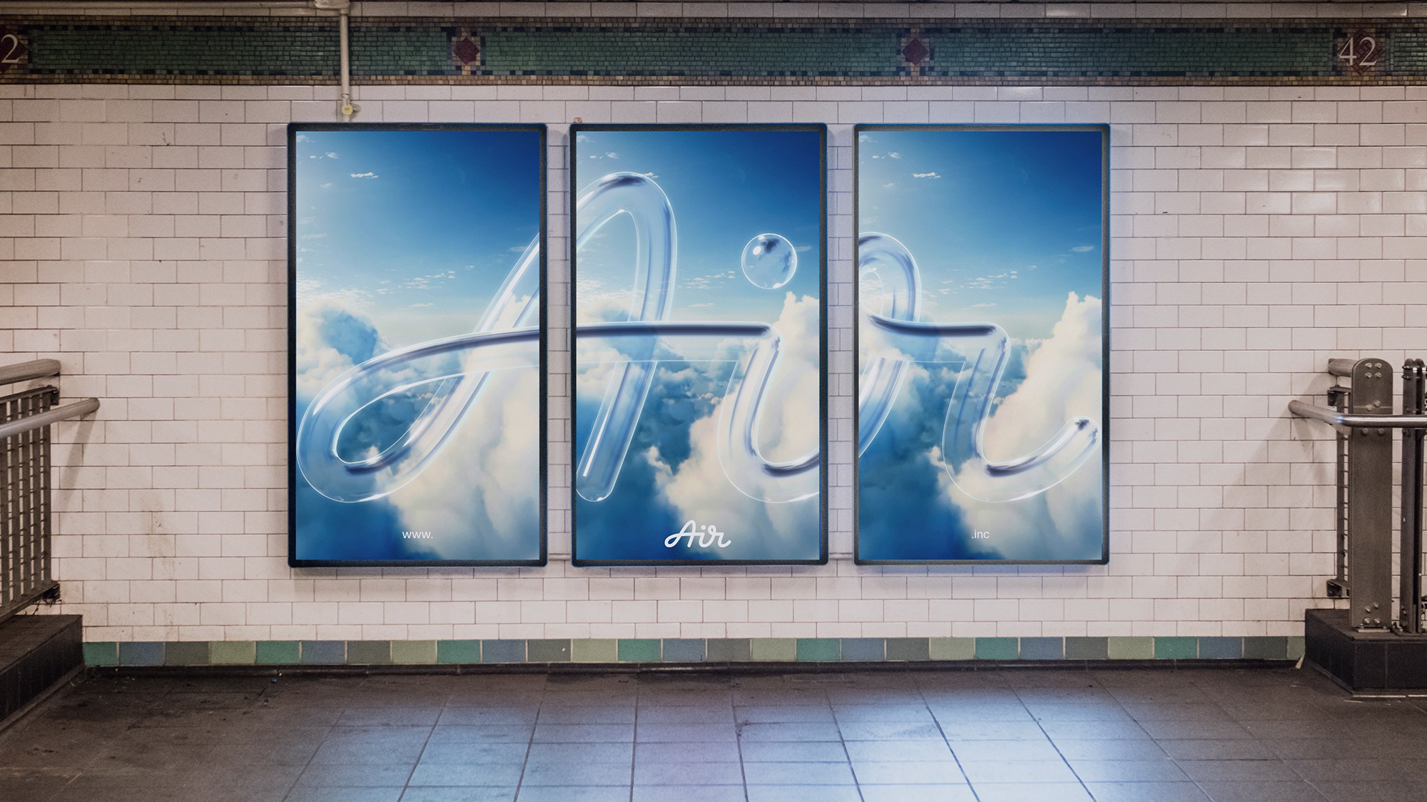
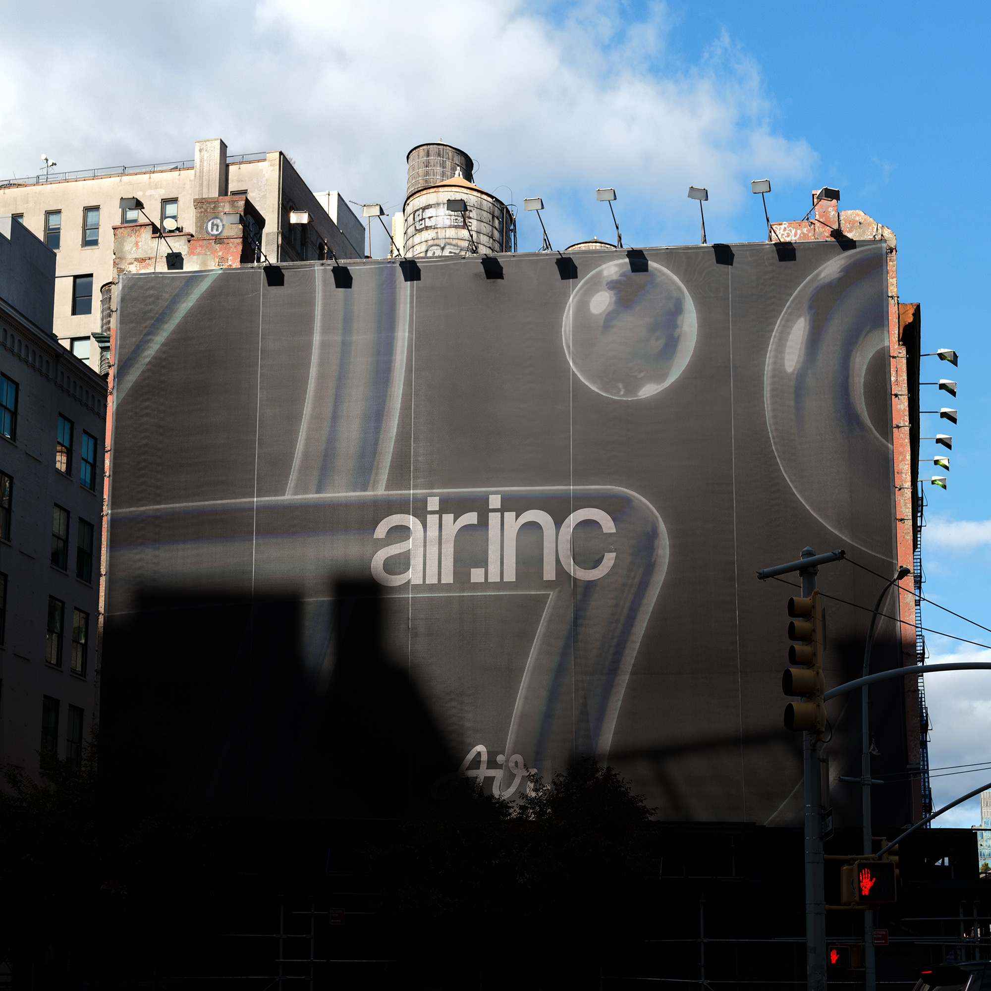
The founders of AIR came to Richard wanting to redo their logo. I happened to pass by Richard’s studio around that time, and was looking at some of the early visual world explorations, and mentioned to him that I loved the ones that evoked a sense of being able to breathe, get some Air, have space to think — they felt like finding a flow state.
A couple of days later he emailed and asked me to do a piece of free association writing on that thought. Just get all the language out of my brain. He asked for a “word salad” to help with the visual world building, saying “logic isn't important, just feelings.”
That was really my introduction to the project. I wrote this stream of consciousness about finding space to breathe and think — creative people and their ideas needing Air. That became the genesis for a way of speaking and behaving, becoming this Airy, floaty conceptual thread that ran through everything from the visual language, to WebGL graphics, to interaction design.
From there, how did you go about nailing down what exactly you wanted the tone to be and the voice to sound like?
I often say voice and tone are distinct—voice is what you believe and stand for, that doesn’t often change, but tone shifts all the time depending on who you’re talking to, and the context.
With AIR, we needed to be able to resonate with both a world-class creative audience, but also be trusted by a technical, security-conscious audience. So we developed this two-pronged voice system; It was irreverent in creative headlines, but followed up with what we called the “capable teammate” in body copy, offering more technical or explanatory information. So the voice could make these really provocative, irreverent, statements, but also be technically precise and trustworthy.
One of the best things about the process was how interdisciplinary it was. The team and our partners were working simultaneously across a new wordmark, custom typefaces, brand voice, web design, WebGL experiments, a core platform redesign, everything was being re-designed all in tandem, constantly informing each other.
Richard was very open to sparring across disciplines, so ideas from an animator or developer, for example, could influence the core design system, the written tone. It was this wonderful, interdisciplinary flow.
Were there any tensions or different directions that came about in the process? Or was it more of a seamless one discipline informing the other?
It might sound chaotic, but I thrive on that. As a creative director, I love processes where I get to bring multidisciplinary practitioners together to collaborate from the outset.
It enables you to rapid prototype and get to a place super quickly where you know the core creative concept can be executed and crafted to an exceptionally high standard across every medium and surface it needs to perform in.
For example, I had this loose notion that the website logo could be really Airy and floaty, with bizarre physics and gravity — but I don’t pretend to know the best way for a Web GL developer to achieve that craft outcome in their specialism. So bringing our developer partners at Made by On in from the inception, experimenting with spinning logos, floating and inflating—all those tests fed back into informing the direction of the overall brand design system and guidelines.
Oftentimes I think that collaborative, experimental spirit is what makes high craft executions possible. You have to find your team's natural strengths, lean into those, and reshape the process accordingly.
I feel like it makes the final product more authentic if you're living the brand as you’re creating it. Did you feel that?
A nice part of this project was that everyone working on it was essentially the target audience. We had really rich discussions and a lot of insight to work with, because we knew the audience so well — we were the target audience.
What approaches or characteristics would you say allow a creative to thrive in sort of multidisciplinary, highly collaborative creative approach?
For me, being open minded, adaptive and playful is essential. It’s one of the things I really loved most about this team. The best leaders balance clear direction with a really playful culture. It enables you to feel free to experiment, try things, even say something silly and have people jump on it. That playful energy is key to creating work that doesn’t feel too safe, that feels really honest, and pushes the envelope.
Do you have a favorite line from the rebrand?
I don’t know if there’s a single favourite line, but the headline writing was definitely the most fun. We had this rebellious tone, speaking of filing systems and naming conventions as these archaic things of the past.
We had a freelance writer supporting, Charlie Bowden, I think he and I could have just gone for days writing those.
Do you find that there are any lines that shouldn't be crossed when you're kind of trying to provoke and kind of trying to speak in that irreverent tone? How do you go about finding that?
For sure. You’ve always got to be mindful of how your work is interpreted. You might want to provoke or push boundaries, but never at the expense of another person. But if you're poking fun at 90’s filing systems, or lack there-of, you're probably OK.
What do you think is appealing and captivating about writing in an irreverent tone? What about it specifically do you think catches people's attention and holds it?
It disrupts the status quo.
I work with a lot of very future-facing companies, and that’s one of the things I enjoy most about it - the opportunity to work on things that genuinely push boundaries, and raise questions. Is there a better way to do work, live, behave?
The funny thing is, most of us don’t realize how absurdly inconvenient or laborious our everyday habits are. Until someone invents and shows us a better way of doing things. Suddenly, what felt normal yesterday looks laughably outdated. Just think about the technology graveyard — VHS tapes — at the time they were these revolutionary objects. Now we can’t help but marvel at how clunky and slow they seem in hindsight. Air sits really nicely in that space.
Do you think there are any tropes that you see brands kind of clinging on to right now that you think it's time to move on from?
Every client I’ve worked with has been so unique, so I wouldn’t make a blanket statement. You’ve got to find what feels right for you and your specific audience. If you feel passionately about something, chances are someone else will too.
What are your insights on how to effectively find that unique perspective and capture a story that speaks to that unique audience?
A lot of the time we make assumptions and rely on our own biases. What was great on this project is we were running a big user research process for the website redesign alongside the branding work — and it ended up informing everything we were crafting.
I conducted more than 20 hours of interviews with Air staff, existing clients and prospects. Through that process, we learned how people truly perceived AIR, the industry, their personal user needs, their working days, and the tonality they responded to. From those conversations came insights we wouldn’t have found otherwise. It gave us clarity on how to structure the website, but also gave us a tonne of language and insights that became food for headlines and content ideas. Doing that groundwork, actually getting out there and having conversations with the people living and breathing it, and learning why they buy or don’t buy something, is always so insightful.
Izzy Colón is a culture writer, creative copywriter, and Contributing Writer for The Subtext. She lives in Chicago, where she spends as much time collecting stories as she does writing them.
Air’s rebrand caught our attention for its movement, flow, and the way it seemed to live among its audience both in the design and the words. We spoke with Richard Turley, Co-Founder and Creative Director at Food, and Kate Baker, Creative Director, to learn how the rebrand came to life through a creative workflow that helped shape Air’s voice and identity.
Can you tell me about Food and how the studio works?
Richard: Food is essentially two senior creatives: me and Iain Tait. We come from different disciplines; Iain is more of a creative technologist, and I’m more of a graphic designer. Both of us have held creative director or ECD roles, but within Food we’ve gravitated toward the work we set out to do at the beginning of our careers. For me, that’s graphic design in all its forms—branding, publication design, identity work.
The model is very collaborative. We have a large network we bring in depending on the project, usually on a day or project rate. That lets us build very specific teams for each client. Aside from Echo, our one full-time designer, everyone else is brought in per project. We also work across two studios, in London and New York, though a lot of our collaborations happen remotely.
Clients often come to either me or Ian individually for our specific skill sets, rather than to “Food” as a brand. Iain’s work tends to focus on creative technology, digital displays, events, AI. My work leans toward branding, publishing, and sometimes more fashion-adjacent projects like magazines and campaigns. Together, that variety becomes the company.
Do you think you have a specific philosophy when it comes to branding? How did it play out in the Air rebrand?
I don’t know if I’d call it a philosophy, but our process is maybe different from most in much as we literally do not have a consistent process. In Air’s case, we built ourselves into their team, moving in with them (figuratively) and breaking down every decision together. There wasn’t a first round, second round, third round; we felt our way through, letting the work take us where it needed to go. It was completely shared and transparent, to the point that we were basically their hands in the process, shaping the system with them rather than for them.
They didn’t like their logo, but I actually thought it wasn’t bad. I told them we could spend six months making another one that might not be that much better. Instead, we focused on adapting it, improving legibility, and building a system underneath it. The problem wasn’t the logo, it was everything that surrounded it.
A good example of that was with typography. We gave them eight typeface options to “try on,” like trying on suits. It was instinctive and quite touchy-feely. From there, we refined: narrowing down choices, building three design “worlds” around their picks, and iterating with them every 7–10 days.
It was about atomizing decisions into small, clear choices: which typeface, which logo variation. That way the client is part of the process, not just handed three options at the beginning and told to choose.
How did verbal strategy play into the process?
About halfway through, we brought in Kate Baker. She worked iteratively too, building off the strategic ideas we’d already embedded in the design, like “Air unblocking creativity.”
We wanted the identity to reflect a duality: bold and expressive for the creative side, but also stable and trustworthy as a software company. Typographically, that meant using tight, condensed type for the creative “voice,” alongside more traditional sans serif forms for the platform. Kate built from that framework, developing two voices—one more maverick and expressive, the other more stable and grounded.
How do you think about “brand friendliness” and the line between being provocative and commercial?
It depends. I don’t think there’s a rule. It depends on the brand and the surfaces where it shows up. I’m not the most corporate designer. I’m more drawn to the people behind creative processes than to the brand itself. A lot of people want to work for Nike or Adidas. To me that would be death, just tedious. But if someone I liked working with called from Nike, I’d do it.
I don’t have fixed ideas about how brands should behave. Every project has its own conditions and outcomes. It’s a mistake to collapse everything into one methodology.
Can you tell me more about the disadvantages of a fixed process?
Companies often go in with a fixed way to sell ideas: three concepts, merged down, production-line style. That’s sensible, but I don’t think the work is very good at the end of it.
The result is everything looking the same. Everyone pulls from the same mood boards. There’s a lack of diversity in thinking. Most things need to look like something in the marketplace to be sold, so they all blur together.
I think the mechanization of process is part of it. Tools like Google Slides have created a methodology that shapes how creatives think and how ideas get sold. With Food, we’ve never wanted to do that. Every company and team is different, so we form around them.
Can you tell me about your creative background and how you got into brand writing?
Kate: I'm a slightly strange creature, I guess. I've had a very eclectic career.
The foundation of my career was in communication design. I started out in graphic design about 20 years ago at Central St. Martins. That’s where I first became interested in how language and image work together.
Over time, I moved into creative direction for design and advertising agencies, and then went on to specialize in technology. I was at Google for many years, where much of my work involved translating dense computer science into simple, palatable storytelling and experience design. The fascination with language, and the craft of getting really meticulous with it, just continued to deepen over time.
What were the earliest explorations or brainstorming around AIR's story and voice?
The founders of AIR came to Richard wanting to redo their logo. I happened to pass by Richard’s studio around that time, and was looking at some of the early visual world explorations, and mentioned to him that I loved the ones that evoked a sense of being able to breathe, get some Air, have space to think — they felt like finding a flow state.
A couple of days later he emailed and asked me to do a piece of free association writing on that thought. Just get all the language out of my brain. He asked for a “word salad” to help with the visual world building, saying “logic isn't important, just feelings.”
That was really my introduction to the project. I wrote this stream of consciousness about finding space to breathe and think — creative people and their ideas needing Air. That became the genesis for a way of speaking and behaving, becoming this Airy, floaty conceptual thread that ran through everything from the visual language, to WebGL graphics, to interaction design.
From there, how did you go about nailing down what exactly you wanted the tone to be and the voice to sound like?
I often say voice and tone are distinct—voice is what you believe and stand for, that doesn’t often change, but tone shifts all the time depending on who you’re talking to, and the context.
With AIR, we needed to be able to resonate with both a world-class creative audience, but also be trusted by a technical, security-conscious audience. So we developed this two-pronged voice system; It was irreverent in creative headlines, but followed up with what we called the “capable teammate” in body copy, offering more technical or explanatory information. So the voice could make these really provocative, irreverent, statements, but also be technically precise and trustworthy.
One of the best things about the process was how interdisciplinary it was. The team and our partners were working simultaneously across a new wordmark, custom typefaces, brand voice, web design, WebGL experiments, a core platform redesign, everything was being re-designed all in tandem, constantly informing each other.
Richard was very open to sparring across disciplines, so ideas from an animator or developer, for example, could influence the core design system, the written tone. It was this wonderful, interdisciplinary flow.
Were there any tensions or different directions that came about in the process? Or was it more of a seamless one discipline informing the other?
It might sound chaotic, but I thrive on that. As a creative director, I love processes where I get to bring multidisciplinary practitioners together to collaborate from the outset.
It enables you to rapid prototype and get to a place super quickly where you know the core creative concept can be executed and crafted to an exceptionally high standard across every medium and surface it needs to perform in.
For example, I had this loose notion that the website logo could be really Airy and floaty, with bizarre physics and gravity — but I don’t pretend to know the best way for a Web GL developer to achieve that craft outcome in their specialism. So bringing our developer partners at Made by On in from the inception, experimenting with spinning logos, floating and inflating—all those tests fed back into informing the direction of the overall brand design system and guidelines.
Oftentimes I think that collaborative, experimental spirit is what makes high craft executions possible. You have to find your team's natural strengths, lean into those, and reshape the process accordingly.
I feel like it makes the final product more authentic if you're living the brand as you’re creating it. Did you feel that?
A nice part of this project was that everyone working on it was essentially the target audience. We had really rich discussions and a lot of insight to work with, because we knew the audience so well — we were the target audience.
What approaches or characteristics would you say allow a creative to thrive in sort of multidisciplinary, highly collaborative creative approach?
For me, being open minded, adaptive and playful is essential. It’s one of the things I really loved most about this team. The best leaders balance clear direction with a really playful culture. It enables you to feel free to experiment, try things, even say something silly and have people jump on it. That playful energy is key to creating work that doesn’t feel too safe, that feels really honest, and pushes the envelope.
Do you have a favorite line from the rebrand?
I don’t know if there’s a single favourite line, but the headline writing was definitely the most fun. We had this rebellious tone, speaking of filing systems and naming conventions as these archaic things of the past.
We had a freelance writer supporting, Charlie Bowden, I think he and I could have just gone for days writing those.
Do you find that there are any lines that shouldn't be crossed when you're kind of trying to provoke and kind of trying to speak in that irreverent tone? How do you go about finding that?
For sure. You’ve always got to be mindful of how your work is interpreted. You might want to provoke or push boundaries, but never at the expense of another person. But if you're poking fun at 90’s filing systems, or lack there-of, you're probably OK.
What do you think is appealing and captivating about writing in an irreverent tone? What about it specifically do you think catches people's attention and holds it?
It disrupts the status quo.
I work with a lot of very future-facing companies, and that’s one of the things I enjoy most about it - the opportunity to work on things that genuinely push boundaries, and raise questions. Is there a better way to do work, live, behave?
The funny thing is, most of us don’t realize how absurdly inconvenient or laborious our everyday habits are. Until someone invents and shows us a better way of doing things. Suddenly, what felt normal yesterday looks laughably outdated. Just think about the technology graveyard — VHS tapes — at the time they were these revolutionary objects. Now we can’t help but marvel at how clunky and slow they seem in hindsight. Air sits really nicely in that space.
Do you think there are any tropes that you see brands kind of clinging on to right now that you think it's time to move on from?
Every client I’ve worked with has been so unique, so I wouldn’t make a blanket statement. You’ve got to find what feels right for you and your specific audience. If you feel passionately about something, chances are someone else will too.
What are your insights on how to effectively find that unique perspective and capture a story that speaks to that unique audience?
A lot of the time we make assumptions and rely on our own biases. What was great on this project is we were running a big user research process for the website redesign alongside the branding work — and it ended up informing everything we were crafting.
I conducted more than 20 hours of interviews with Air staff, existing clients and prospects. Through that process, we learned how people truly perceived AIR, the industry, their personal user needs, their working days, and the tonality they responded to. From those conversations came insights we wouldn’t have found otherwise. It gave us clarity on how to structure the website, but also gave us a tonne of language and insights that became food for headlines and content ideas. Doing that groundwork, actually getting out there and having conversations with the people living and breathing it, and learning why they buy or don’t buy something, is always so insightful.
Izzy Colón is a culture writer, creative copywriter, and Contributing Writer for The Subtext. She lives in Chicago, where she spends as much time collecting stories as she does writing them.