
Why Restraint is the Sharpest Strategy
Trust in science is fracturing along political lines at the time it matters most. Billions in US research funding frozen, misinformation research defunded at federal level and hundreds of anti-science bills introduced across state legislatures. A 2025 report found that public trust in science in the US had significantly declined – only 8% of US adults reported “a great trust in science” a 24% drop from 2023.
But the problem runs deeper than policy and public opinion. Most science organizations still talk like they’re addressing a lecture hall, too dense, too jargony or too earnest to land with decision-makers.
It doesn’t instill confidence. Science deals with complex information, with rigor and datasets that are difficult to grasp. But this complexity makes clarity all the more crucial. In a time when institutions face increasing skepticism, restraint is often the sharpest creative strategy.
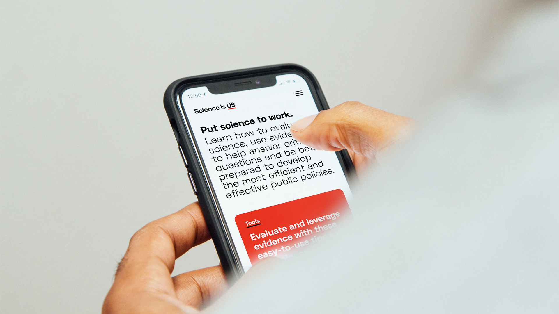
This insight was central to the verbal and visual identity we created for Science is US, a non-partisan initiative backed by eight major science and engineering organizations, advocating for greater use of evidence in public policy. To become the go-to resource for credible information, the organization needed to cut through the noise with a simple, straight-forward approach.
Designing for clarity
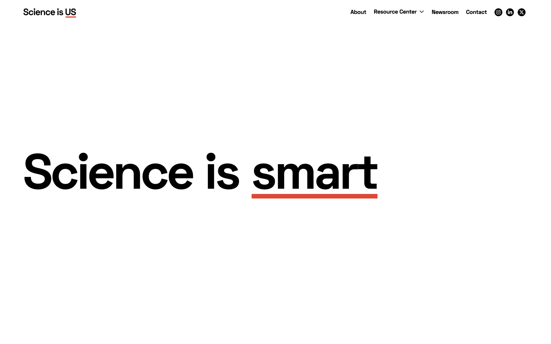
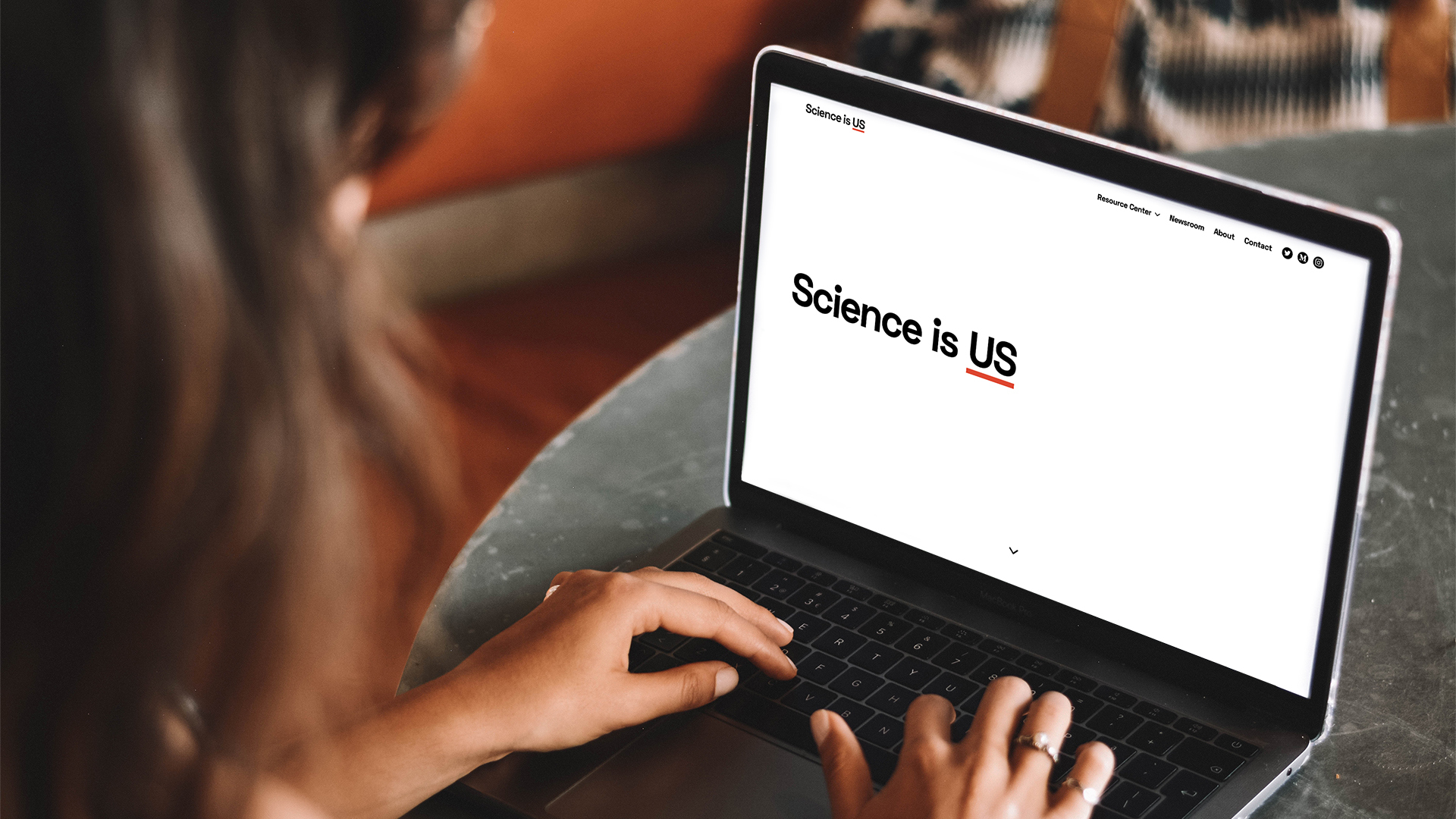
The bold, deliberately under-designed identity centers around a name that is intentionally simple. Carrying a double meaning in its three words, it signifies collective ownership and national identity. In effect it’s a positioning statement disguised as a plain statement of fact. The final word is also allowed to cycle through different definitions and descriptors of science (‘smart’, ‘me’, ‘everywhere’) before landing on the final description of ‘Science is US’.
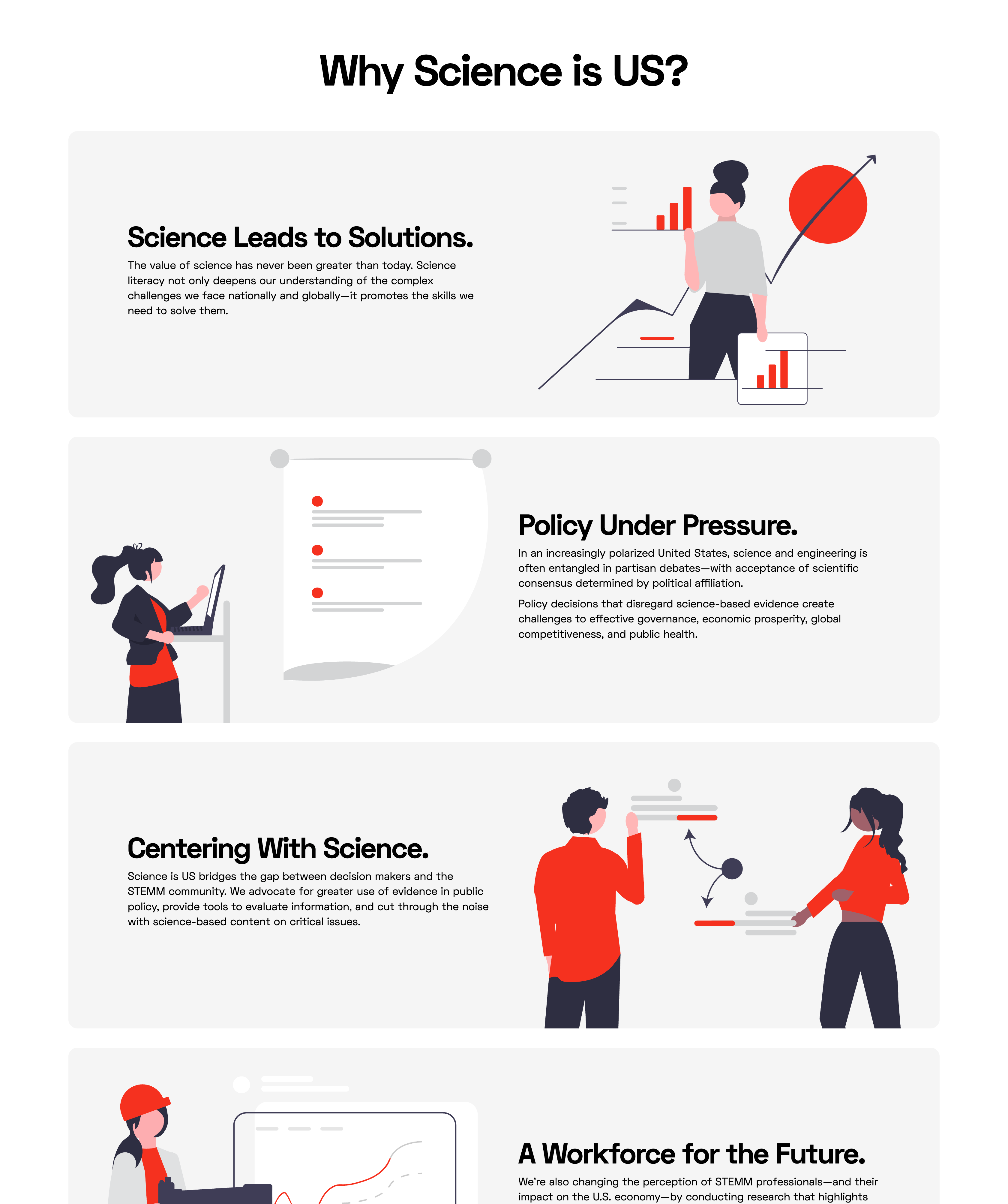
From this central name and logo, the copywriting unfolds with equal clarity and focus. Its aim is to distill complex, jargon-heavy content into simple, digestible ideas. Phrases like ‘science leads to solutions’ and ‘policy under pressure’ encapsulate big ideas in just a few words, framing content with clarity and purpose.
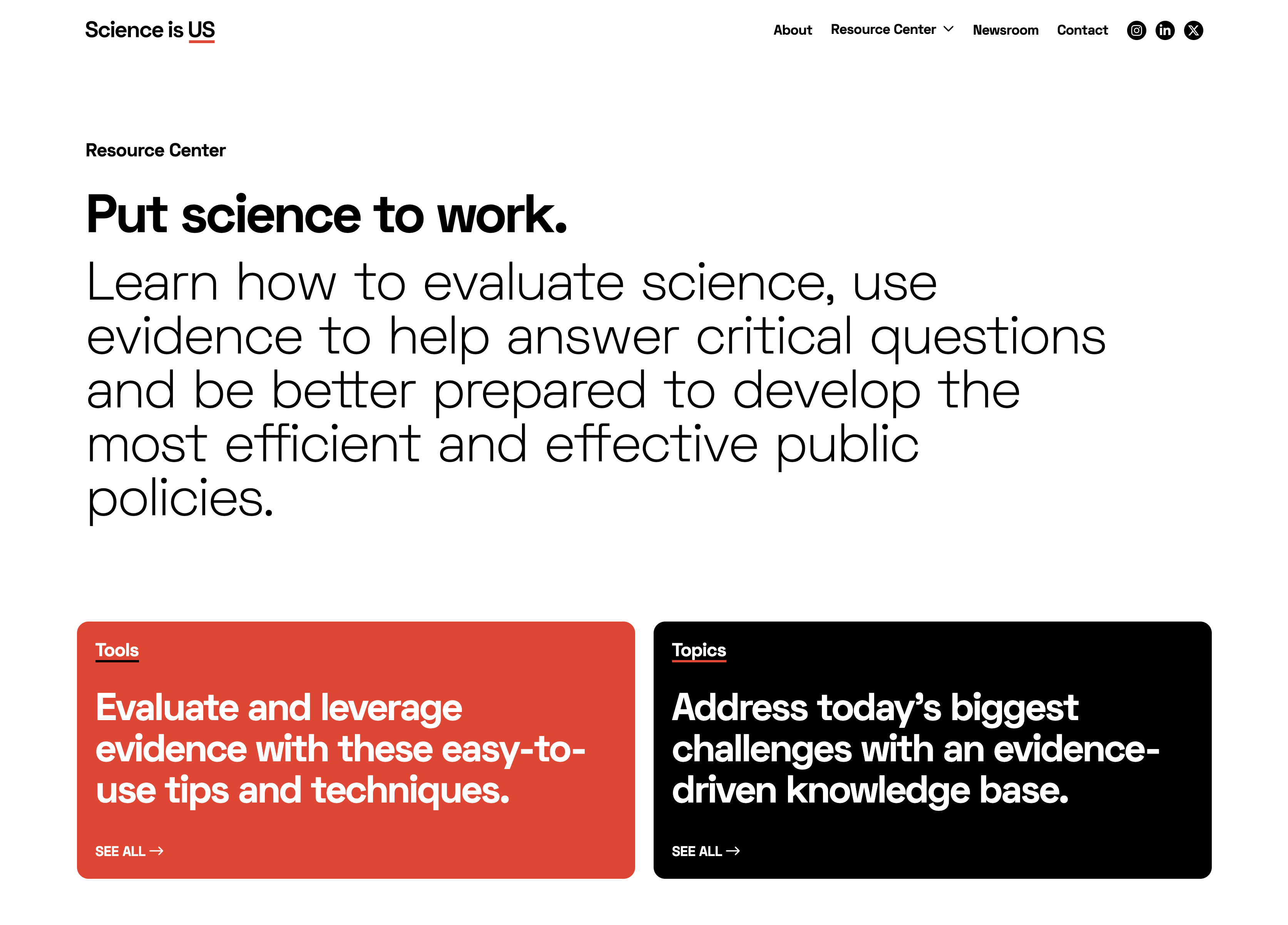
Visually, the brand’s restraint also underscores its authenticity. A single typeface in two weights, a two-color palette and minimal graphics ensure the brand supports the message rather than overshadowing it. The design of the website’s ‘resource center’ exemplifies how restraint can enhance usability, using the pared-back visual toolkit to organize complex topics into digestible sections. Tools like ‘how to assess credible information’ and topical guides on issues like climate change provide policymakers with clear, actionable resources.
Overall, the look and feel of the information had to underpin, not deflect from or embellish, the unique value of the organization: the authentic coming together of non-traditional allies in a nonpartisan way to affect change. The restrained branding resolved a key tension: how to unify diverse organizations under one identity without appearing overly polished or manipulative.
Building trust through simplicity
Restraint in design and copywriting can often deliver the most compelling results. It allows you to boil things down to essentials; to simplify and distill complex information into its core elements. It ensures that a message is clear and easy to understand, which in turn makes it easier for audiences to trust an institution’s intentions. Where cluttered designs and messaging can erode trust, simplicity builds it by exuding clarity and focus.
This approach isn't limited to science organizations. News organizations, for example, can use restrained branding to emphasize credibility and focus on facts. And in our work with museums - among the most trusted institutions in American life, ranking just behind friends and family - we've seen how restraint can frame content, letting the art or exhibits take center stage.
In an era where trust is fragile and skepticism runs high, restraint can be a necessity for all those who want to cut through the noise and stand as beacons of credibility.
BIO
With over thirty-five years of design and business experience, John Ball is known for the clarity and simplicity of his work. Combining strategic, practical thinking with meticulously executed creative, he’s built long-term relationships with global brands, including technology pioneer Intel and legendary audio icon Shure.
Additionally, a passion for public good and the arts has led to collaborations with the Smithsonian, the American Association for the Advancement of Science, and the Institute of Contemporary Art, San Diego. John also served on the Lux Art Institute’s board of directors, creating the innovative arts organization’s brand identity and overseeing its award-winning communication program for fifteen years.
His work has been recognized by organizations including Communication Arts, AIGA, Graphis, ReBrand, The American Association of Museums, and was selected for the 2005 California Design Biennial at the Pasadena Museum of Art.
Why Restraint is the Sharpest Strategy
Trust in science is fracturing along political lines at the time it matters most. Billions in US research funding frozen, misinformation research defunded at federal level and hundreds of anti-science bills introduced across state legislatures. A 2025 report found that public trust in science in the US had significantly declined – only 8% of US adults reported “a great trust in science” a 24% drop from 2023.
But the problem runs deeper than policy and public opinion. Most science organizations still talk like they’re addressing a lecture hall, too dense, too jargony or too earnest to land with decision-makers.
It doesn’t instill confidence. Science deals with complex information, with rigor and datasets that are difficult to grasp. But this complexity makes clarity all the more crucial. In a time when institutions face increasing skepticism, restraint is often the sharpest creative strategy.
This insight was central to the verbal and visual identity we created for Science is US, a non-partisan initiative backed by eight major science and engineering organizations, advocating for greater use of evidence in public policy. To become the go-to resource for credible information, the organization needed to cut through the noise with a simple, straight-forward approach.
Designing for clarity
The bold, deliberately under-designed identity centers around a name that is intentionally simple. Carrying a double meaning in its three words, it signifies collective ownership and national identity. In effect it’s a positioning statement disguised as a plain statement of fact. The final word is also allowed to cycle through different definitions and descriptors of science (‘smart’, ‘me’, ‘everywhere’) before landing on the final description of ‘Science is US’.
From this central name and logo, the copywriting unfolds with equal clarity and focus. Its aim is to distill complex, jargon-heavy content into simple, digestible ideas. Phrases like ‘science leads to solutions’ and ‘policy under pressure’ encapsulate big ideas in just a few words, framing content with clarity and purpose.
Visually, the brand’s restraint also underscores its authenticity. A single typeface in two weights, a two-color palette and minimal graphics ensure the brand supports the message rather than overshadowing it. The design of the website’s ‘resource center’ exemplifies how restraint can enhance usability, using the pared-back visual toolkit to organize complex topics into digestible sections. Tools like ‘how to assess credible information’ and topical guides on issues like climate change provide policymakers with clear, actionable resources.
Overall, the look and feel of the information had to underpin, not deflect from or embellish, the unique value of the organization: the authentic coming together of non-traditional allies in a nonpartisan way to affect change. The restrained branding resolved a key tension: how to unify diverse organizations under one identity without appearing overly polished or manipulative.
Building trust through simplicity
Restraint in design and copywriting can often deliver the most compelling results. It allows you to boil things down to essentials; to simplify and distill complex information into its core elements. It ensures that a message is clear and easy to understand, which in turn makes it easier for audiences to trust an institution’s intentions. Where cluttered designs and messaging can erode trust, simplicity builds it by exuding clarity and focus.
This approach isn't limited to science organizations. News organizations, for example, can use restrained branding to emphasize credibility and focus on facts. And in our work with museums - among the most trusted institutions in American life, ranking just behind friends and family - we've seen how restraint can frame content, letting the art or exhibits take center stage.
In an era where trust is fragile and skepticism runs high, restraint can be a necessity for all those who want to cut through the noise and stand as beacons of credibility.
BIO
With over thirty-five years of design and business experience, John Ball is known for the clarity and simplicity of his work. Combining strategic, practical thinking with meticulously executed creative, he’s built long-term relationships with global brands, including technology pioneer Intel and legendary audio icon Shure.
Additionally, a passion for public good and the arts has led to collaborations with the Smithsonian, the American Association for the Advancement of Science, and the Institute of Contemporary Art, San Diego. John also served on the Lux Art Institute’s board of directors, creating the innovative arts organization’s brand identity and overseeing its award-winning communication program for fifteen years.
His work has been recognized by organizations including Communication Arts, AIGA, Graphis, ReBrand, The American Association of Museums, and was selected for the 2005 California Design Biennial at the Pasadena Museum of Art.
Further Reading


.png)
