Rowena Curlewis has spent more than two decades doing one thing: building brands in the beverage industry. As co-founder and CEO of Denomination, global drinks brand specialists — with studios in Sydney, London, New York, and San Francisco.
Her recent project Bento, a wine designed specifically to pair with Japanese and Asian food, is a useful case study in something the industry frequently gets wrong: assuming a product needs reinvention when what it actually needs is a new conversation.
This month, we asked Rowena about audience gaps, cultural fluency, and what it actually takes to bring a brand into a new community.
Denomination has been a drinks-only agency since 2002. What does that kind of specialization teach you about brands that a generalist practice wouldn’t?
Of all the disciplines, drinks branding is arguably one of the hardest to get right. Consumer purchasing behaviour in drinks is very different to other categories. Specialisation teaches you that drinks brands aren’t bought, they’re chosen - often in seconds, often emotionally, and often in crowded, high-pressure environments.
When you work exclusively in drinks, you start to see the category as a system, not a series of isolated brands. You understand the micro-decisions consumers make at shelf, in bar, or on a menu. You understand how memory structures are built and broken. And you learn that what looks like a small design move can have a disproportionate commercial impact.
For us at Denomination, specialisation sharpens three things.
The first is instinct. After two decades in one category, you develop a very precise sense of what will cut through and what will disappear: not just creatively, but commercially too.
Second, having a respect for category codes. Generalists often default to disruption for its own sake, but in drinks you learn that growth comes from knowing which rules to keep and which to break. That balance is where brands become both distinctive and credible, which enables consumers to trust, and that in turn drives purchase.
The last is understanding the reality of how brands live in the world. Drinks brands exist physically in hands, homes, bars, and fridges. Purchasing a drinks brand is akin to social currency. Packaging isn’t just an asset, it is the final brand experience, and this forces a level of rigour and accountability that many other categories don’t demand.
So the difference that specialisation makes isn’t just about our depth of knowledge, but rather it’s a fundamentally different way of thinking. We call it “Intelligent Bravery” – a combination of strategic rigour that comes from having 24+ years of experience, with creative courage that’s reflected in the design work we produce.
How do you typically know when a brand has an audience problem versus a product problem?
Whether it’s an audience or a product problem comes down to behaviour. If consumers try the product and don’t come back, it’s likely to be a product problem. No amount of branding will fix a lack of quality, relevance or differentiation in the liquid itself. In drinks, repeat purchase is the ultimate truth signal. We always say to our clients that we’ll get you the first purchase, but the second purchase is down to the winemaker/distiller/brewer!
However if consumers don’t try your brand in the first place, it’s usually an audience or brand problem. The brand is either not being seen, not being understood, or not being chosen. That can come down to everything from weak distinctive assets to unclear positioning, to simply blending into the category.
Where it gets more nuanced is when trial is happening, but it’s the wrong audience. That’s often a strategy issue, that is the brand is attracting people it can’t satisfy, or communicating in a way that misrepresents the experience.
What category specialisation gives you is pattern recognition: you start to see the signals early - distribution without velocity, strong awareness without conversion, high trial with low loyalty. Each of those points to a different root cause.
When a client comes to you saying they want to reach a new community of consumers, what’s the first thing you want to understand?
The first thing I would want to understand is why this new community of consumers would care about your brand. As much as we’d like to think otherwise, new consumers aren’t really sitting around waiting to be targeted! They’re already buying something else, with habits, preferences and cultural cues that are deeply ingrained. So you need to ascertain why the client’s brand has a right to show up in their world.
We would first start by interrogating the product truth: is there something genuinely relevant in taste, format, occasion or proposition, that earns the brand a place with this audience? If not, you’re asking branding to do a job it can’t sustain. Then we’d look at cultural alignment: what does this community value, signal and reject? And where is the overlap with the brand’s existing equities? The goal isn’t to reinvent the brand, it’s to find a credible bridge between who you are and who you want to reach. Finally you’d need to ascertain the consequences as reaching a new audience often means leaving something behind. This may mean the need for different codes, different cues, and sometimes even different channels. You need to be clear on what you’re willing to give up.
It's our belief that the brands that succeed aren’t the ones that chase new consumers: they’re the ones that give those consumers a compelling reason to come to them.
Tell us about the Bento brief. What was the opportunity Fourth Wave saw, and what did they ask you to solve?
Fourth Wave came to us with a very clear opportunity - Japanese cuisine is popular globally, yet wine has largely failed to show up credibly in that space, allowing beer, sake and RTDs to dominate. Wine just felt disconnected from the occasion, and from the sense of Japanese “coolness”.
So the brief wasn’t “design a Japanese wine” but instead to create a wine brand that would complement modern Japanese dining culture, and that could recruit a younger, more exploratory consumer into wine in the process.
Essentially what they asked us to solve was a tension: how do you build something that is culturally resonant without being pastiche? Distinctive on shelf, but appropriate to the occasion? And importantly, how do you do that while still behaving like a wine brand?
What did the research or discovery phase look like? How did you get to the cultural references you ended up using?
Cultural immersion was key because the risk with a brief like Bento is obvious - you either stay too safely in wine and it feels irrelevant, or you lean too hard into Japanese cues and it becomes superficial, even appropriative. The work had to sit in that narrow space of authentic resonance.
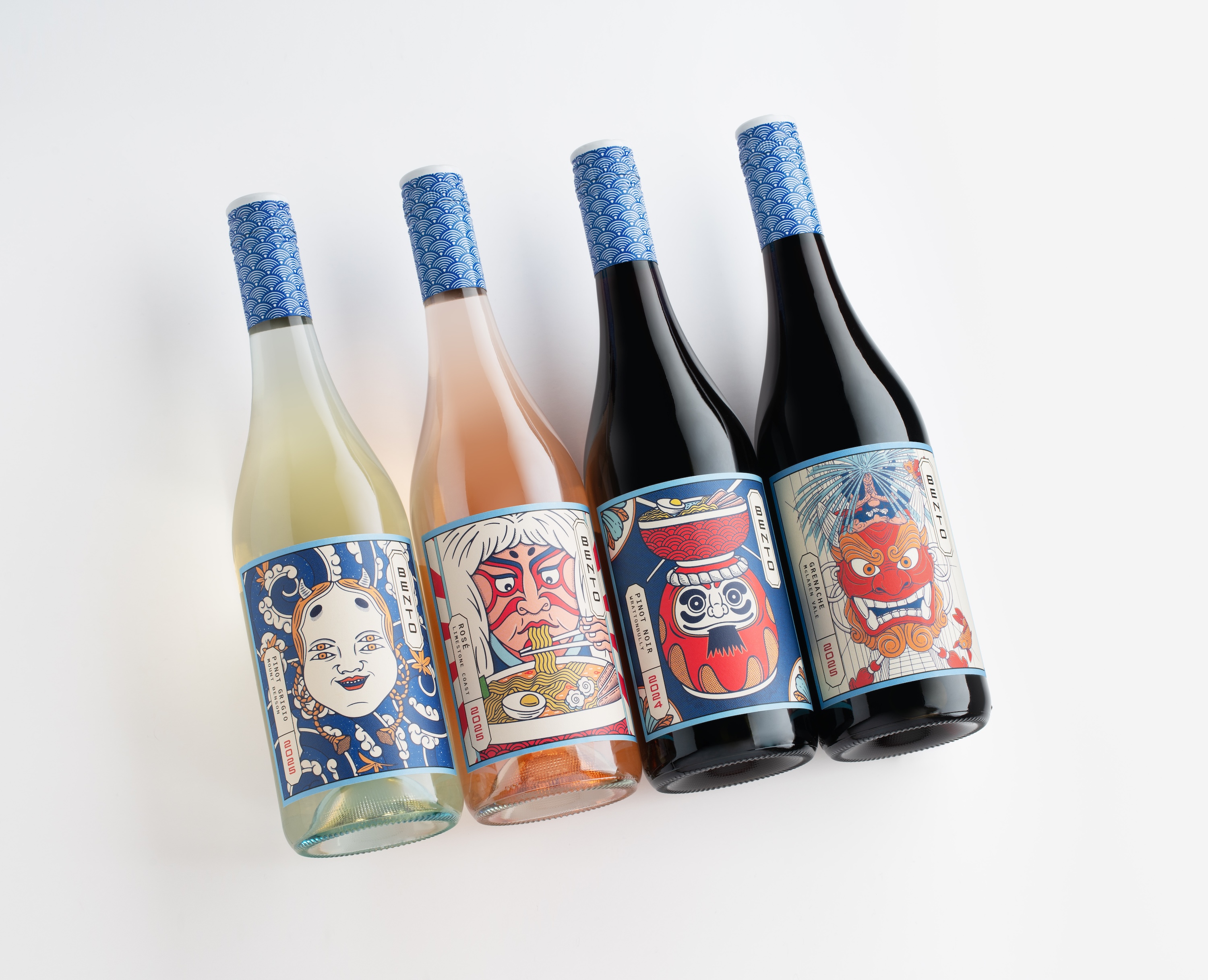
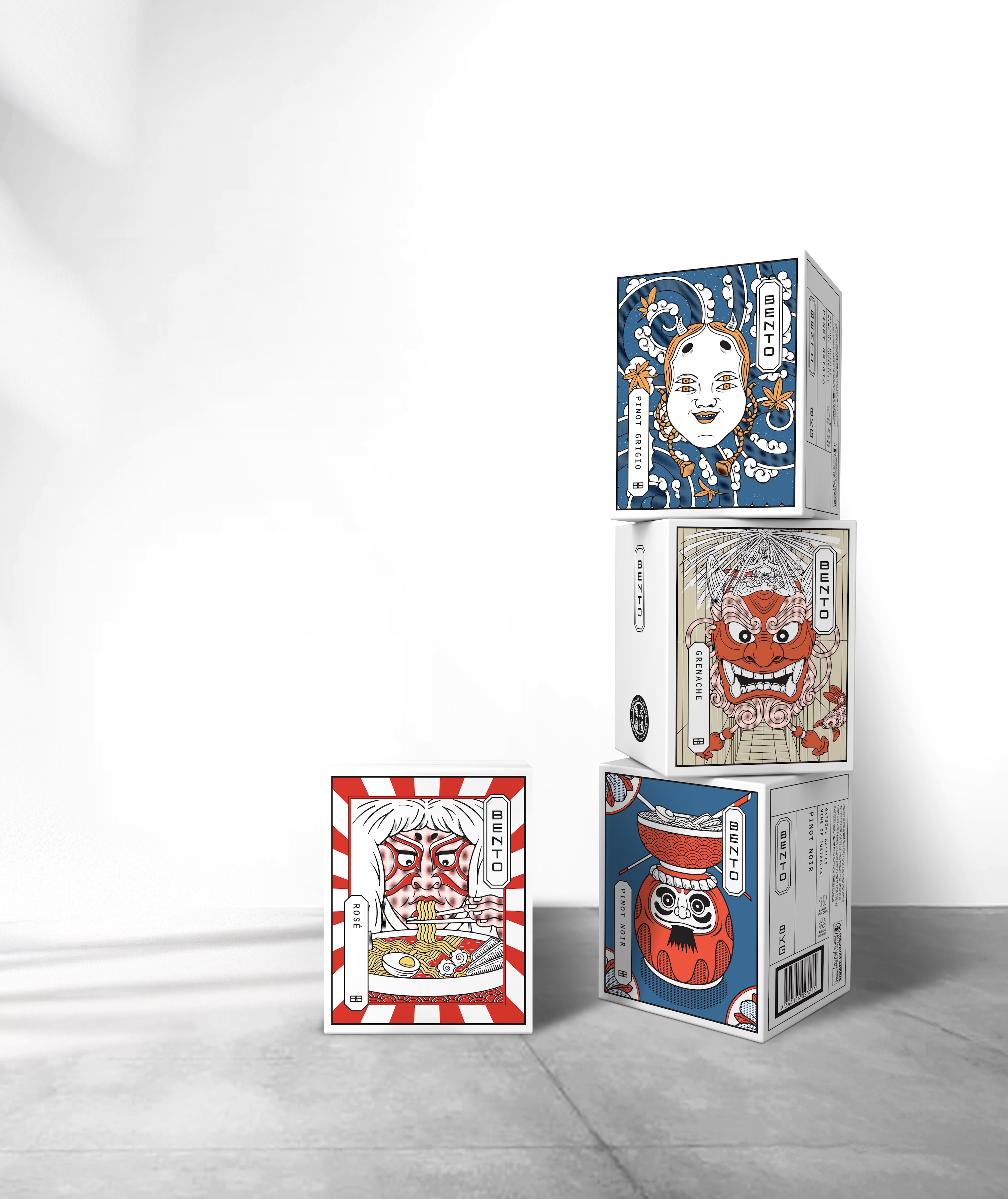
We spent time unpacking what sits beneath the aesthetic of Japanese culture and design: principles like precision and modularity, but often with a sense of “a wink and a smile”. When you think of the architecture of a bento box, elements are housed in their own defined space. So we did the same with the typographic treatment – not only using Japanese-inspired letter forms treated vertically, but also housed in their lozenge shapes. A lot of Japan’s art features a red mark of sorts, and so we treated the vintage in red, using the same typography as the brand’s logotype.
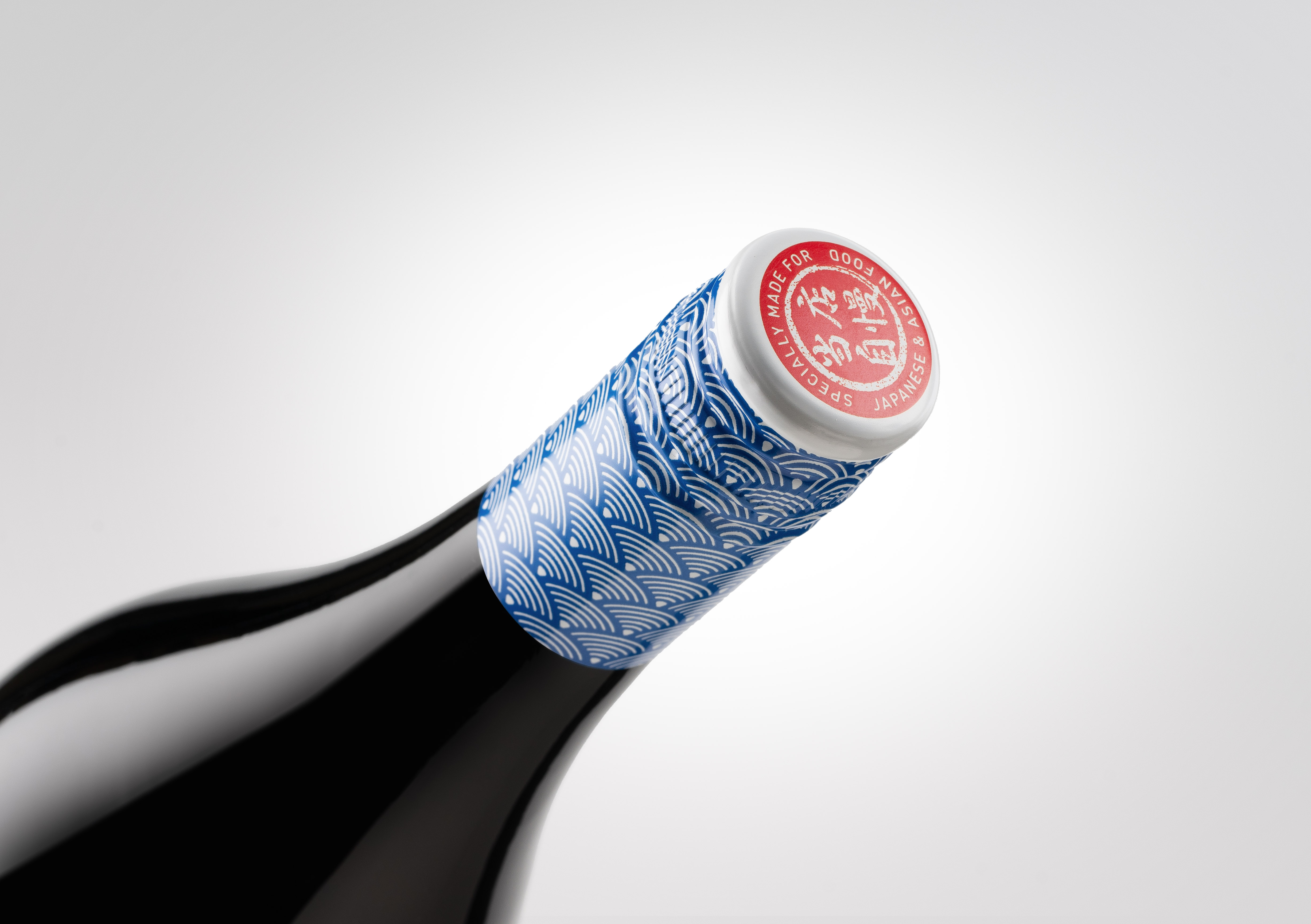
Then the labels feature a range of old-school illustrations of uniquely Japanese characters. There’s a warmth and humour to the illustrations which creates a friendly approachable brand feel that aligns to the warmth of the Japanese personality. The capsule design has been inspired by ubiquitous Japanese ceramics in tones of blue.
The stamp has been created which takes inspiration from the “Speciality of the House” stamp often used in Japanese restaurants, but in this case worded to communicate the purpose of the wine: “Specially made for Japanese & Asian Food”.
All of the graphic elements are connected to elements of Japanese culture, but without being formulaic or cliched.
Was there a decision in the process that, in hindsight, made the brand work — something that could have easily gone another way?
We worked closely with a Japanese cultural advisor at every step of the creative process to ensure that we were not inadvertently being disrespectful of Japanese culture, history or artefacts. We did have concerns that perhaps some of the images were too humorous, but we were assured that this quirky sense of humour was something that the Japanese people revere about themselves.
Bento needed to work for two different audiences at once — people deeply familiar with Japanese culture and people who weren’t. How did the naming and the language on the pack navigate that?
Great question because it highlighted the tension we needed to solve. If you lean too far towards cultural insiders, you alienate the broader market. If you simplify for mass appeal, you lose credibility with the very culture you’re drawing from. Bento had to hold both, without feeling like it was trying too hard to please either.
Luckily the name did a lot of heavy lifting. “Bento” is one of those rare words that has travelled globally thanks to the popularity of Japanese cuisine. We avoided over-explaining or trying to “educate” the consumer on Japan, which is where we feel that some brands fall into pastiche.
For those consumers who are culturally fluent, the references are there in the composition, the balance, the typographic approach, the semiotics of blue and red. For everyone else, it simply works as a distinctive, contemporary wine brand. Clear varietal cues, strong shelf impact, engaging personality, and a sense that this is a different kind of wine occasion which is more informal, more shareable, more exploratory, and – importantly – more fun!


You’ve worked across wine, spirits, beer, and cider for over two decades. Where do you see the biggest communication gaps — categories still talking to the wrong room?
In terms of communication, I think that the gap is a misalignment between who brands think they’re talking to, and who’s actually buying their brand! Wine is an obvious example here. Despite the leaps and bounds that some of the New World producers have made in terms of creating and evolving brands to meet the needs of today’s audiences (across all generations), many of the Old World producers continue to over-index on heritage, provenance and technical detail. Unintentionally they continue to speak fluently to connoisseurs while unintentionally excluding everyone else! Meanwhile the new generations are choosing drinks based on occasion, mood and social context, and wine is failing to deliver relevance to them.
Additionally, many of the drinks categories – but particularly spirits and wines – are still talking primarily in product language. The disconnect is simple: categories are selling product cues whilst consumers are responding to cultural ones.
How do you think about the relationship between cultural specificity and broad appeal? Does designing for a particular community limit a brand or strengthen it?
One of the biggest pitfalls is brands that get designed to appeal to “everyone” and end up meaning nothing to anyone. It’s vital for brands to stand for something, clearly and effectively.
Cultural specificity, if done properly, is a strength because it gives a brand an edge. It creates recognisable signals, a point of view, and something people can attach to. And in a crowded category, that clarity is what drives both memory and choice.
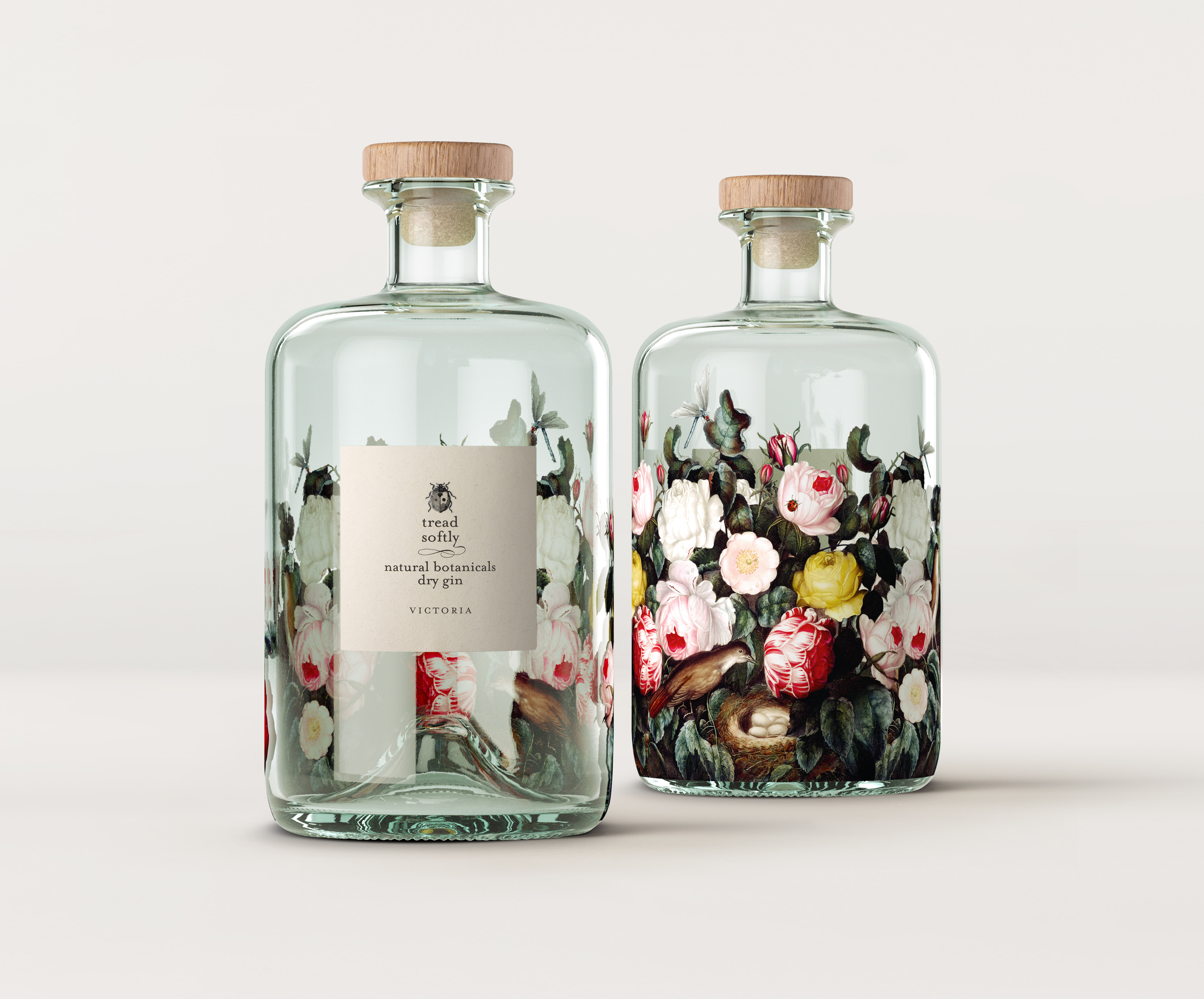
The misconception is that specificity limits scale, but in reality the opposite is true. The brands that connect with consumers are the ones that start from something real and defined. They don’t dilute themselves to be broadly acceptable; they build a core that is compelling to a certain group of consumers, who in turn create their own community. Tread Softly has done this extremely well with its creation of an engaged, thriving community connected both online and through the physicality of consumer events.
Bonus round
What communities do you find most valuable in your own work and life?
Professionally, of course, it’s the creative community that is most valuable to me – especially given I run a creative agency! But in all seriousness, those in the creative community who relish problem-solving are a joy to be around, and continuously make me think differently because of their work.
Equally is the drinks community. It’s both massive, and tiny at the same time. It’s a community that is generally so kind to each other. In our first ten years of business, our new business strategy was literally to answer calls of producers who’d been told by their mates to call us if they needed great design thinking. That generosity in sharing recommendations and insight is very unusual in categories outside of drinks. We are members of The Porto Protocol, a NFP group of sustainably-minded individuals and businesses in the drinks industry. Information is shared to benefit all, not just a few. It’s a remarkable industry to work in.
Personally, communities such as friends and family are great reminders that others don’t care about the nuances that we obsess over at Denomination! They just know what brands and drinks they like, and why they fit into their lives. I listen intently – some of the best ideas come as a result of late-night dinner conversations!
What’s your dream brief?
A dream brief is always a defined problem or opportunity to solve. Conversely, the worst brief is a “you can do anything” as most of the time the best ideas come from the tension that needs to be solved.
Who’s doing community well in brands right now?
Out of the drinks category, Alo is doing community extremely well. It’s built a world that people just want to belong to. From its studios and events to its ambassador network and social presence, everything reinforces a very specific version of wellness — elevated, aesthetic, aspirational, but still accessible enough to join. It made me give up my Lululemons and swap to Alo!
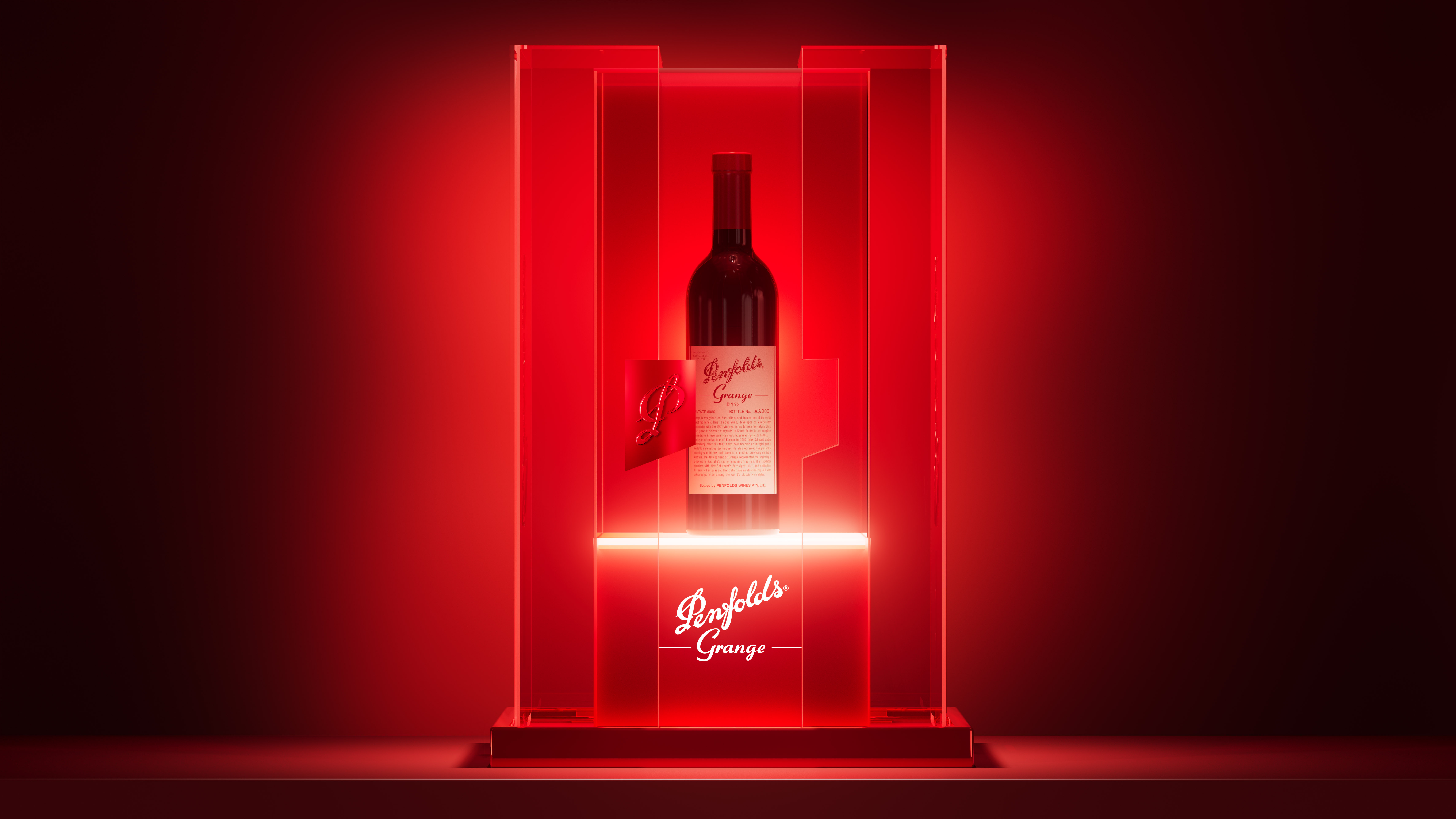
Penfolds is doing a great job of creating several different yet equally strong communities. For their connoisseurs, they build following and connection by way of The Kalimna Club and also their popular Recorking Clinics. For their new luxurian consumers, the hosting of Penfolds tasting events that are akin to cool nightclubs rather than stuffy white table clothed events, has enabled a new community to be created.
If you weren’t doing this, what would you be doing?
I honestly can’t answer this: I have the best job in the world. I get to be inspired every day by the creative genius of our design and production teams, the brilliant thinking of our strategists, the smarts of client management and marketing teams. Every day my leadership team demonstrates what excellence looks like. It’s a joy. Then, I get to work in an industry that I’m super passionate about. Drinks is the ultimate social connector, and as the world gets crazier, we need social connection more than ever. I wouldn’t want to do anything else.
Last thing you read that you passed on to someone else?
I love The Economist, and I leave a pile of them for my dad (an ex-journalist) to read when I visit him at the family farm.
Rowena Curlewis has spent more than two decades doing one thing: building brands in the beverage industry. As co-founder and CEO of Denomination, global drinks brand specialists — with studios in Sydney, London, New York, and San Francisco.
Her recent project Bento, a wine designed specifically to pair with Japanese and Asian food, is a useful case study in something the industry frequently gets wrong: assuming a product needs reinvention when what it actually needs is a new conversation.
This month, we asked Rowena about audience gaps, cultural fluency, and what it actually takes to bring a brand into a new community.
Denomination has been a drinks-only agency since 2002. What does that kind of specialization teach you about brands that a generalist practice wouldn’t?
Of all the disciplines, drinks branding is arguably one of the hardest to get right. Consumer purchasing behaviour in drinks is very different to other categories. Specialisation teaches you that drinks brands aren’t bought, they’re chosen - often in seconds, often emotionally, and often in crowded, high-pressure environments.
When you work exclusively in drinks, you start to see the category as a system, not a series of isolated brands. You understand the micro-decisions consumers make at shelf, in bar, or on a menu. You understand how memory structures are built and broken. And you learn that what looks like a small design move can have a disproportionate commercial impact.
For us at Denomination, specialisation sharpens three things.
The first is instinct. After two decades in one category, you develop a very precise sense of what will cut through and what will disappear: not just creatively, but commercially too.
Second, having a respect for category codes. Generalists often default to disruption for its own sake, but in drinks you learn that growth comes from knowing which rules to keep and which to break. That balance is where brands become both distinctive and credible, which enables consumers to trust, and that in turn drives purchase.
The last is understanding the reality of how brands live in the world. Drinks brands exist physically in hands, homes, bars, and fridges. Purchasing a drinks brand is akin to social currency. Packaging isn’t just an asset, it is the final brand experience, and this forces a level of rigour and accountability that many other categories don’t demand.
So the difference that specialisation makes isn’t just about our depth of knowledge, but rather it’s a fundamentally different way of thinking. We call it “Intelligent Bravery” – a combination of strategic rigour that comes from having 24+ years of experience, with creative courage that’s reflected in the design work we produce.
How do you typically know when a brand has an audience problem versus a product problem?
Whether it’s an audience or a product problem comes down to behaviour. If consumers try the product and don’t come back, it’s likely to be a product problem. No amount of branding will fix a lack of quality, relevance or differentiation in the liquid itself. In drinks, repeat purchase is the ultimate truth signal. We always say to our clients that we’ll get you the first purchase, but the second purchase is down to the winemaker/distiller/brewer!
However if consumers don’t try your brand in the first place, it’s usually an audience or brand problem. The brand is either not being seen, not being understood, or not being chosen. That can come down to everything from weak distinctive assets to unclear positioning, to simply blending into the category.
Where it gets more nuanced is when trial is happening, but it’s the wrong audience. That’s often a strategy issue, that is the brand is attracting people it can’t satisfy, or communicating in a way that misrepresents the experience.
What category specialisation gives you is pattern recognition: you start to see the signals early - distribution without velocity, strong awareness without conversion, high trial with low loyalty. Each of those points to a different root cause.
When a client comes to you saying they want to reach a new community of consumers, what’s the first thing you want to understand?
The first thing I would want to understand is why this new community of consumers would care about your brand. As much as we’d like to think otherwise, new consumers aren’t really sitting around waiting to be targeted! They’re already buying something else, with habits, preferences and cultural cues that are deeply ingrained. So you need to ascertain why the client’s brand has a right to show up in their world.
We would first start by interrogating the product truth: is there something genuinely relevant in taste, format, occasion or proposition, that earns the brand a place with this audience? If not, you’re asking branding to do a job it can’t sustain. Then we’d look at cultural alignment: what does this community value, signal and reject? And where is the overlap with the brand’s existing equities? The goal isn’t to reinvent the brand, it’s to find a credible bridge between who you are and who you want to reach. Finally you’d need to ascertain the consequences as reaching a new audience often means leaving something behind. This may mean the need for different codes, different cues, and sometimes even different channels. You need to be clear on what you’re willing to give up.
It's our belief that the brands that succeed aren’t the ones that chase new consumers: they’re the ones that give those consumers a compelling reason to come to them.
Tell us about the Bento brief. What was the opportunity Fourth Wave saw, and what did they ask you to solve?
Fourth Wave came to us with a very clear opportunity - Japanese cuisine is popular globally, yet wine has largely failed to show up credibly in that space, allowing beer, sake and RTDs to dominate. Wine just felt disconnected from the occasion, and from the sense of Japanese “coolness”.
So the brief wasn’t “design a Japanese wine” but instead to create a wine brand that would complement modern Japanese dining culture, and that could recruit a younger, more exploratory consumer into wine in the process.
Essentially what they asked us to solve was a tension: how do you build something that is culturally resonant without being pastiche? Distinctive on shelf, but appropriate to the occasion? And importantly, how do you do that while still behaving like a wine brand?
What did the research or discovery phase look like? How did you get to the cultural references you ended up using?
Cultural immersion was key because the risk with a brief like Bento is obvious - you either stay too safely in wine and it feels irrelevant, or you lean too hard into Japanese cues and it becomes superficial, even appropriative. The work had to sit in that narrow space of authentic resonance.
We spent time unpacking what sits beneath the aesthetic of Japanese culture and design: principles like precision and modularity, but often with a sense of “a wink and a smile”. When you think of the architecture of a bento box, elements are housed in their own defined space. So we did the same with the typographic treatment – not only using Japanese-inspired letter forms treated vertically, but also housed in their lozenge shapes. A lot of Japan’s art features a red mark of sorts, and so we treated the vintage in red, using the same typography as the brand’s logotype.
Then the labels feature a range of old-school illustrations of uniquely Japanese characters. There’s a warmth and humour to the illustrations which creates a friendly approachable brand feel that aligns to the warmth of the Japanese personality. The capsule design has been inspired by ubiquitous Japanese ceramics in tones of blue.
The stamp has been created which takes inspiration from the “Speciality of the House” stamp often used in Japanese restaurants, but in this case worded to communicate the purpose of the wine: “Specially made for Japanese & Asian Food”.
All of the graphic elements are connected to elements of Japanese culture, but without being formulaic or cliched.
Was there a decision in the process that, in hindsight, made the brand work — something that could have easily gone another way?
We worked closely with a Japanese cultural advisor at every step of the creative process to ensure that we were not inadvertently being disrespectful of Japanese culture, history or artefacts. We did have concerns that perhaps some of the images were too humorous, but we were assured that this quirky sense of humour was something that the Japanese people revere about themselves.
Bento needed to work for two different audiences at once — people deeply familiar with Japanese culture and people who weren’t. How did the naming and the language on the pack navigate that?
Great question because it highlighted the tension we needed to solve. If you lean too far towards cultural insiders, you alienate the broader market. If you simplify for mass appeal, you lose credibility with the very culture you’re drawing from. Bento had to hold both, without feeling like it was trying too hard to please either.
Luckily the name did a lot of heavy lifting. “Bento” is one of those rare words that has travelled globally thanks to the popularity of Japanese cuisine. We avoided over-explaining or trying to “educate” the consumer on Japan, which is where we feel that some brands fall into pastiche.
For those consumers who are culturally fluent, the references are there in the composition, the balance, the typographic approach, the semiotics of blue and red. For everyone else, it simply works as a distinctive, contemporary wine brand. Clear varietal cues, strong shelf impact, engaging personality, and a sense that this is a different kind of wine occasion which is more informal, more shareable, more exploratory, and – importantly – more fun!
You’ve worked across wine, spirits, beer, and cider for over two decades. Where do you see the biggest communication gaps — categories still talking to the wrong room?
In terms of communication, I think that the gap is a misalignment between who brands think they’re talking to, and who’s actually buying their brand! Wine is an obvious example here. Despite the leaps and bounds that some of the New World producers have made in terms of creating and evolving brands to meet the needs of today’s audiences (across all generations), many of the Old World producers continue to over-index on heritage, provenance and technical detail. Unintentionally they continue to speak fluently to connoisseurs while unintentionally excluding everyone else! Meanwhile the new generations are choosing drinks based on occasion, mood and social context, and wine is failing to deliver relevance to them.
Additionally, many of the drinks categories – but particularly spirits and wines – are still talking primarily in product language. The disconnect is simple: categories are selling product cues whilst consumers are responding to cultural ones.
How do you think about the relationship between cultural specificity and broad appeal? Does designing for a particular community limit a brand or strengthen it?
One of the biggest pitfalls is brands that get designed to appeal to “everyone” and end up meaning nothing to anyone. It’s vital for brands to stand for something, clearly and effectively.
Cultural specificity, if done properly, is a strength because it gives a brand an edge. It creates recognisable signals, a point of view, and something people can attach to. And in a crowded category, that clarity is what drives both memory and choice.
The misconception is that specificity limits scale, but in reality the opposite is true. The brands that connect with consumers are the ones that start from something real and defined. They don’t dilute themselves to be broadly acceptable; they build a core that is compelling to a certain group of consumers, who in turn create their own community. Tread Softly has done this extremely well with its creation of an engaged, thriving community connected both online and through the physicality of consumer events.
Bonus round
What communities do you find most valuable in your own work and life?
Professionally, of course, it’s the creative community that is most valuable to me – especially given I run a creative agency! But in all seriousness, those in the creative community who relish problem-solving are a joy to be around, and continuously make me think differently because of their work.
Equally is the drinks community. It’s both massive, and tiny at the same time. It’s a community that is generally so kind to each other. In our first ten years of business, our new business strategy was literally to answer calls of producers who’d been told by their mates to call us if they needed great design thinking. That generosity in sharing recommendations and insight is very unusual in categories outside of drinks. We are members of The Porto Protocol, a NFP group of sustainably-minded individuals and businesses in the drinks industry. Information is shared to benefit all, not just a few. It’s a remarkable industry to work in.
Personally, communities such as friends and family are great reminders that others don’t care about the nuances that we obsess over at Denomination! They just know what brands and drinks they like, and why they fit into their lives. I listen intently – some of the best ideas come as a result of late-night dinner conversations!
What’s your dream brief?
A dream brief is always a defined problem or opportunity to solve. Conversely, the worst brief is a “you can do anything” as most of the time the best ideas come from the tension that needs to be solved.
Who’s doing community well in brands right now?
Out of the drinks category, Alo is doing community extremely well. It’s built a world that people just want to belong to. From its studios and events to its ambassador network and social presence, everything reinforces a very specific version of wellness — elevated, aesthetic, aspirational, but still accessible enough to join. It made me give up my Lululemons and swap to Alo!
Penfolds is doing a great job of creating several different yet equally strong communities. For their connoisseurs, they build following and connection by way of The Kalimna Club and also their popular Recorking Clinics. For their new luxurian consumers, the hosting of Penfolds tasting events that are akin to cool nightclubs rather than stuffy white table clothed events, has enabled a new community to be created.
If you weren’t doing this, what would you be doing?
I honestly can’t answer this: I have the best job in the world. I get to be inspired every day by the creative genius of our design and production teams, the brilliant thinking of our strategists, the smarts of client management and marketing teams. Every day my leadership team demonstrates what excellence looks like. It’s a joy. Then, I get to work in an industry that I’m super passionate about. Drinks is the ultimate social connector, and as the world gets crazier, we need social connection more than ever. I wouldn’t want to do anything else.
Last thing you read that you passed on to someone else?
I love The Economist, and I leave a pile of them for my dad (an ex-journalist) to read when I visit him at the family farm.
Further Reading