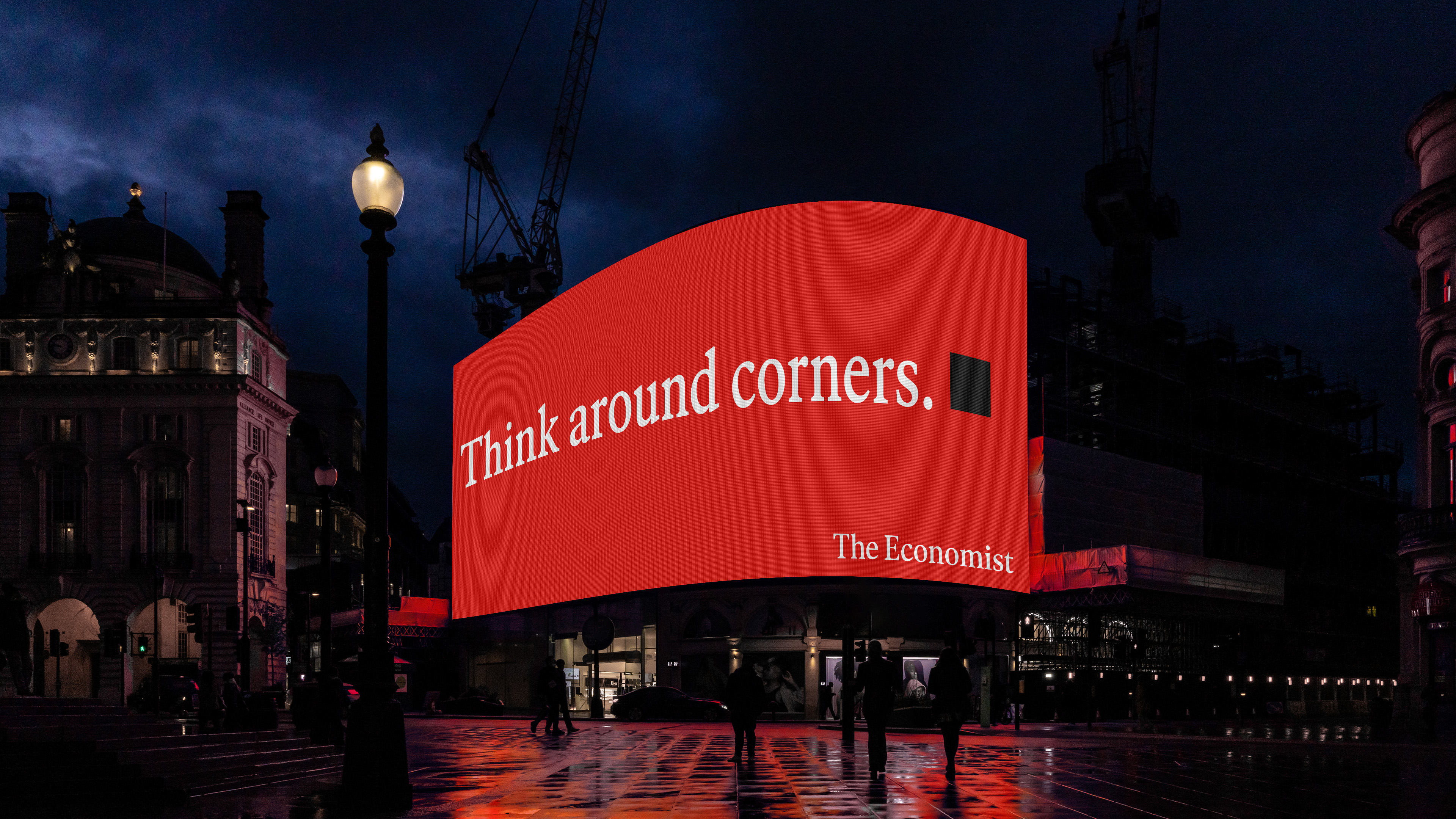
When crafting an organization’s identity, tonality, or messaging, it’s always tempting to wonder: Is this too bold for the client? Too audacious for their audience? Too colorful? Too weird? Not weird enough?
It’s a funny side effect of our business. As the experts, we’re constantly second-guessing our clients, dedicated to a funny combination of prescience and bargaining, trying to predict how clients and audiences will react and how far we can push things without losing them. But by doing this, we’re asking the wrong questions.
Speaking Boldly
In their "Dream Crazy" campaign, Nike sparked viral conversation with their iconic tagline through the voice of social activist and former NFL quarterback, Colin Kaepernick. Burger King's "Moldy Whopper" broke advertising norms to reveal the beauty in fresh, preservative-free ingredients. There are countless examples of brands known for bold messaging. But we tell ourselves: That’s because they’re huge brands — can we get away with that in our work, especially when we’re dealing with a more complicated subject than hamburgers?

The Language of Grief
When a nonprofit called empowerHER reached out for help evolving their name, brand, and website, our whole studio was inspired by their mission and story. Founded by Cara Belvin, the organization was formed to help support young girls who were navigating the loss of their mother, a challenge that mirrored Cara’s own experience of losing her mother when she was young. As the organization grew, Cara and her team expanded their mission: today they support all young people, regardless of gender or type of parent loss, to build a unique, uplifting community defined by shared experience and connection. The organization teaches children that loss is survivable, pairing them with mentors who have also lost a parent and hosting supportive, community-driven events.

To start the project, we conducted interviews with the community — mentors, mentees, volunteers, team members — and what we found surprised me. For an organization that deals with such a heavy topic and supports children at perhaps the darkest moment of their lives, we found that the stories weren’t about sadness or mourning. They were about community, about confidence, about connection — participants spoke passionately and enthusiastically about finding a group that understood them and their experience, for the first time.
Inspired, our team evolved the organization’s name —from empowerHER to Empower — and created a bold, uplifting identity to match the organization’s new inclusive program and better tell their story. We infused our messaging, tonality, and visuals with this spirit of empowerment and optimism over the typically hopeless imagery and language of grief.

It would have been easy to lean on traditional grief messaging. And at first, that’s what my instinct was telling us to do. I was worried about being too bold, too confident, too brash. With such a sensitive topic, would it make more sense to play it safe? If we went too far, would we upset a child who recently lost their father or alienate a newly-widowed parent looking for support for their children?
As writers, designers, and strategists, we’re always telling our clients — implicitly or explicitly — to trust us, but working with Empower reminded me that it’s just as important to trust your audience. The stories we heard from the Empower community showed us the audience didn’t need or want the standard grief messaging. They didn’t want a brand that treated them like they were fragile and bubble-wrapped. They wanted something that felt bold, confident, and empowering — a story and a brand that mirrored the powerful, transformative effect the Empower program has on its participants, proving that loss is survivable.
Lessons Learned
Throughout the process of working on Empower’s brand, it was easy to second-guess ourselves, to wonder if we should water down our messaging, our imagery, our visuals — all in an attempt to answer those recurring questions: Will they embrace it? Will they get it? And I did plenty of that along the way — but ultimately, we trusted the shared vision uncovered in our interviews and discovery work. We trusted our client team and their approach to grief through empowerment over pity or pure commiseration. And most of all, we trusted our audience.
Sure, the Colin Kaepernick ad campaign works because of Nike’s track record. But they built this track record through trust, through belief in their audience’s ability to understand and connect with a complicated or unexpected message. That’s a lesson that can apply to any brand, no matter the size and category. If you listen to your audience and trust them, you won’t have to sacrifice the quality of your message. You can go big with your storytelling in a way that's both compelling and authentic, whether you’re speaking to a record-breaking athlete or a 13-year-old kid.
Bio:
Sam Lee is Head of Strategy at Team, an independent strategy and design studio.
Project credits:
Creative Direction: Amy Globus and John Clark
Art Direction and Design: Stephanie Zabala, Bao Hu, Ioan Butiu
Strategy and Copywriting: Sam Lee, Chelsea Sy
Logotype Refinement: Space Type
Website Development: Studio123
When crafting an organization’s identity, tonality, or messaging, it’s always tempting to wonder: Is this too bold for the client? Too audacious for their audience? Too colorful? Too weird? Not weird enough?
It’s a funny side effect of our business. As the experts, we’re constantly second-guessing our clients, dedicated to a funny combination of prescience and bargaining, trying to predict how clients and audiences will react and how far we can push things without losing them. But by doing this, we’re asking the wrong questions.
Speaking Boldly
In their "Dream Crazy" campaign, Nike sparked viral conversation with their iconic tagline through the voice of social activist and former NFL quarterback, Colin Kaepernick. Burger King's "Moldy Whopper" broke advertising norms to reveal the beauty in fresh, preservative-free ingredients. There are countless examples of brands known for bold messaging. But we tell ourselves: That’s because they’re huge brands — can we get away with that in our work, especially when we’re dealing with a more complicated subject than hamburgers?

The Language of Grief
When a nonprofit called empowerHER reached out for help evolving their name, brand, and website, our whole studio was inspired by their mission and story. Founded by Cara Belvin, the organization was formed to help support young girls who were navigating the loss of their mother, a challenge that mirrored Cara’s own experience of losing her mother when she was young. As the organization grew, Cara and her team expanded their mission: today they support all young people, regardless of gender or type of parent loss, to build a unique, uplifting community defined by shared experience and connection. The organization teaches children that loss is survivable, pairing them with mentors who have also lost a parent and hosting supportive, community-driven events.

To start the project, we conducted interviews with the community — mentors, mentees, volunteers, team members — and what we found surprised me. For an organization that deals with such a heavy topic and supports children at perhaps the darkest moment of their lives, we found that the stories weren’t about sadness or mourning. They were about community, about confidence, about connection — participants spoke passionately and enthusiastically about finding a group that understood them and their experience, for the first time.
Inspired, our team evolved the organization’s name —from empowerHER to Empower — and created a bold, uplifting identity to match the organization’s new inclusive program and better tell their story. We infused our messaging, tonality, and visuals with this spirit of empowerment and optimism over the typically hopeless imagery and language of grief.

It would have been easy to lean on traditional grief messaging. And at first, that’s what my instinct was telling us to do. I was worried about being too bold, too confident, too brash. With such a sensitive topic, would it make more sense to play it safe? If we went too far, would we upset a child who recently lost their father or alienate a newly-widowed parent looking for support for their children?
As writers, designers, and strategists, we’re always telling our clients — implicitly or explicitly — to trust us, but working with Empower reminded me that it’s just as important to trust your audience. The stories we heard from the Empower community showed us the audience didn’t need or want the standard grief messaging. They didn’t want a brand that treated them like they were fragile and bubble-wrapped. They wanted something that felt bold, confident, and empowering — a story and a brand that mirrored the powerful, transformative effect the Empower program has on its participants, proving that loss is survivable.
Lessons Learned
Throughout the process of working on Empower’s brand, it was easy to second-guess ourselves, to wonder if we should water down our messaging, our imagery, our visuals — all in an attempt to answer those recurring questions: Will they embrace it? Will they get it? And I did plenty of that along the way — but ultimately, we trusted the shared vision uncovered in our interviews and discovery work. We trusted our client team and their approach to grief through empowerment over pity or pure commiseration. And most of all, we trusted our audience.
Sure, the Colin Kaepernick ad campaign works because of Nike’s track record. But they built this track record through trust, through belief in their audience’s ability to understand and connect with a complicated or unexpected message. That’s a lesson that can apply to any brand, no matter the size and category. If you listen to your audience and trust them, you won’t have to sacrifice the quality of your message. You can go big with your storytelling in a way that's both compelling and authentic, whether you’re speaking to a record-breaking athlete or a 13-year-old kid.
Bio:
Sam Lee is Head of Strategy at Team, an independent strategy and design studio.
Project credits:
Creative Direction: Amy Globus and John Clark
Art Direction and Design: Stephanie Zabala, Bao Hu, Ioan Butiu
Strategy and Copywriting: Sam Lee, Chelsea Sy
Logotype Refinement: Space Type
Website Development: Studio123


