Daniel Edmundson is no stranger to large, consequential brand work. He’s had stops at Mother and Gretel before landing at SYLVAIN, and he’s even been interviewed by us before. Last time, we talked about how he thinks, how he moves between strategy and design, his allergy to the lone-wolf creative myth, and why Philadelphia suits him better than New York. This time, there's new work to talk about.
SYLVAIN's refreshed brand identity of Etsy dropped earlier this year, and I'll admit, I had a personal stake in this one. I've been an Etsy lover for years, so when I heard they were refreshing the brand, I was paying close attention. Let's get into it.
Etsy has the rare combination of being a big brand and a beloved brand. But with any booming business, you also see quality slip and criticism seep in. What was the impetus for this brand refresh, and what was Etsy hoping to accomplish with it?
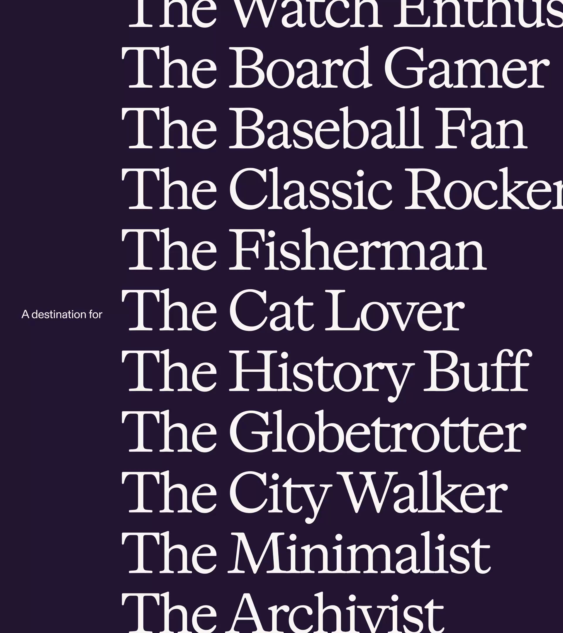
Research revealed that people were primarily going to Etsy when they already knew what they wanted, but not to find new things. Where the brand had previously thrived as a destination for discovery, there was now a ubiquitousness around the online shopping experience. It became tougher for Etsy to stand out, even with a superior and more unique product mix.
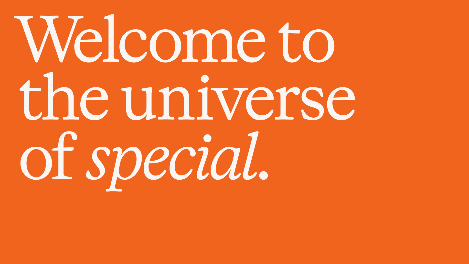
Our brief was to return the brand to the excitement and energy of its original essence—to make Etsy feel more Etsy.
The work landed on "a starting point for special" — Etsy as a catalyst for discovery and connection, not just a place to transact. How did that idea develop? What were some of the learnings that got you there?
We knew that both Etsy shoppers and sellers were stuck. With ongoing shifts in the space producing a kind of paralysis, we had to create a brand that felt more open, creative, and inviting.
Our strategy and design teams sometimes work in parallel, and this was a moment where we all landed on an idea together. Strategy wanted to define Etsy as a place to provoke action and find inspiration, and the design team pushed to capture the platform’s vast product universe with a visual identity that felt human, energetic, and curious.
The combined strategy and design process is a push and pull, a give and take conversation. Operating with that close sense of collaboration allows for those dialogues to happen and also inform each other’s efforts. When it works, it works really well.
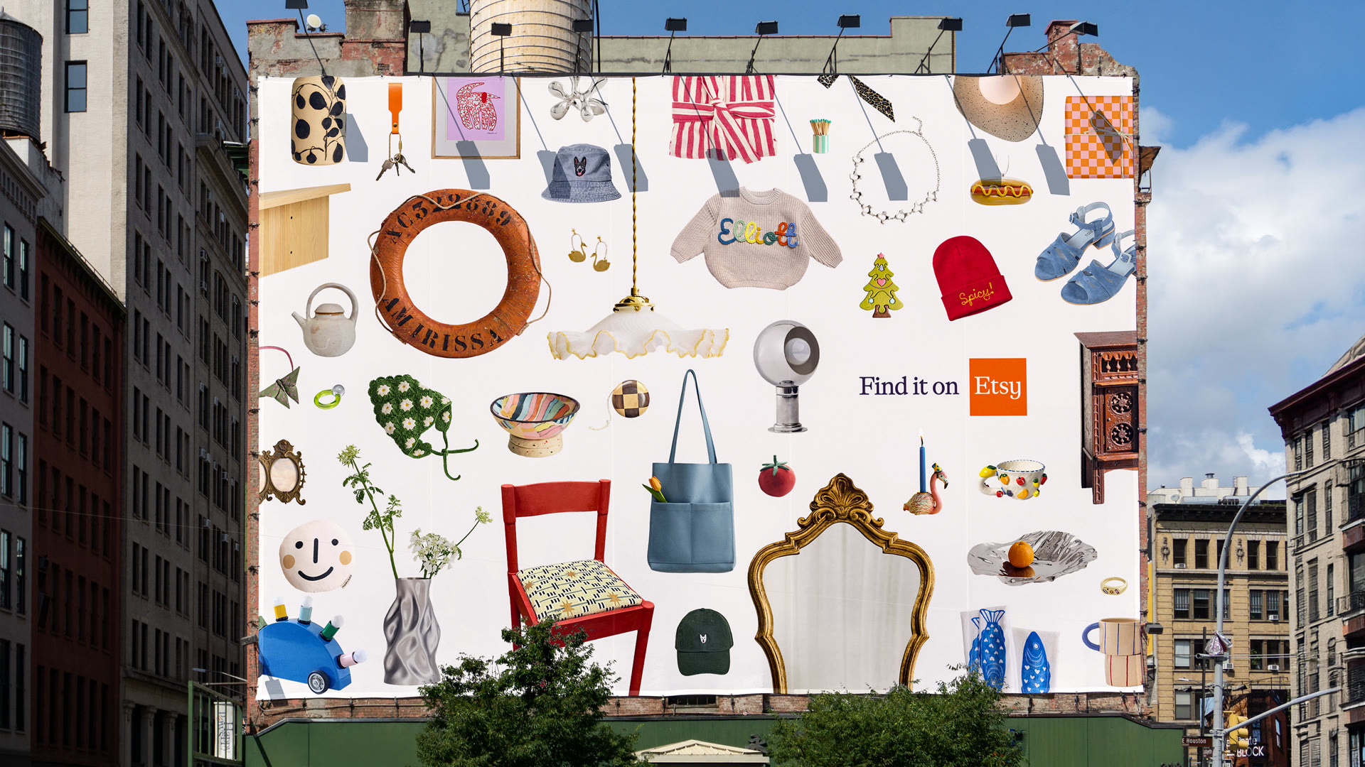
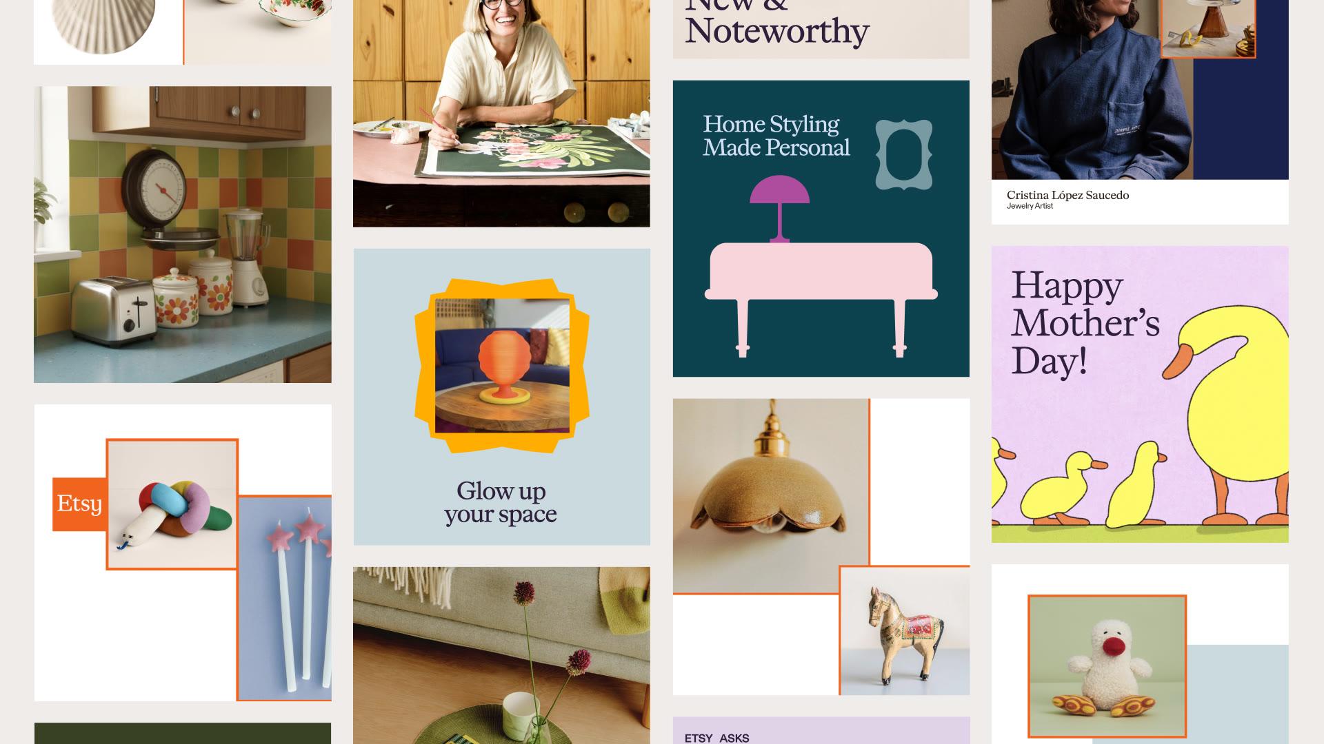
The square became the foundation of the entire system — the logo, the shapes, the motion. How did that come together, and what made it feel like the right structural idea?
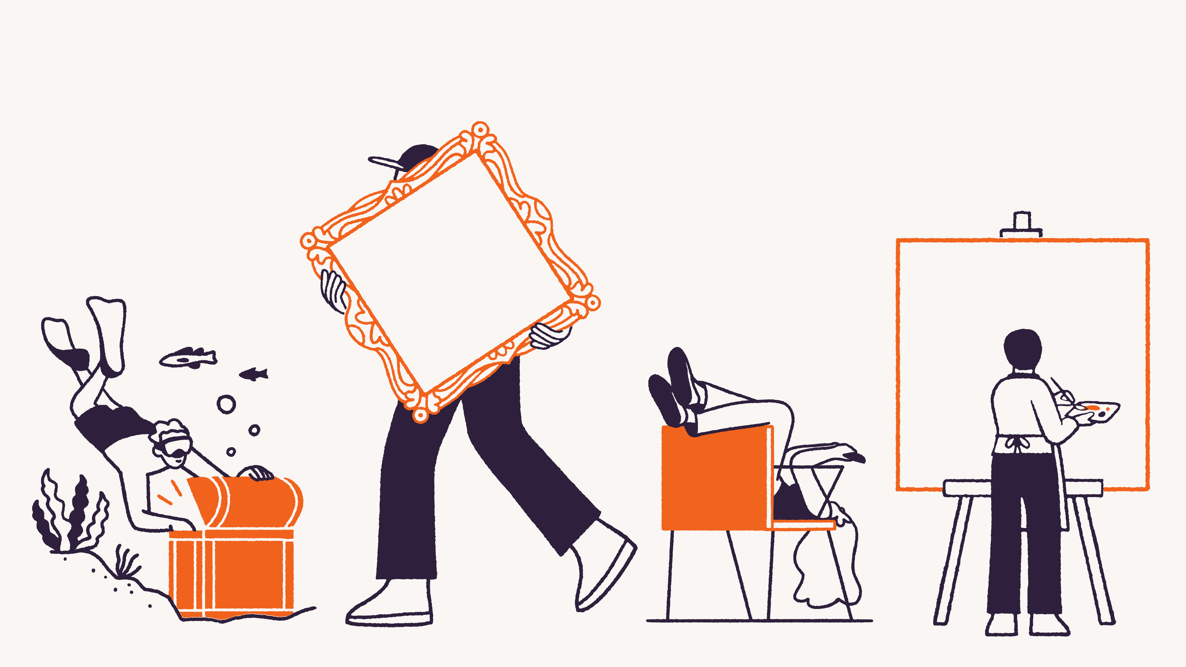
The idea of “a starting point for special” needed to come to life in an easily accessible and understandable way. This is my favorite part of creative strategy: connecting the intent with the expression. The square helps to represent that “square one” starting place. But we also wanted to own a square in a world that’s currently obsessed with rounded corners—to find new ways of representing something special in everything from the curvatures in the wordmark’s letterforms to the identity system’s shape language created from that foundation.
In retrospect, the right idea always looks and feels somewhat natural and inevitable. For Etsy, the square foundation allowed for teams to generate and build so much from a solid basis, we knew it was an ideal solve.
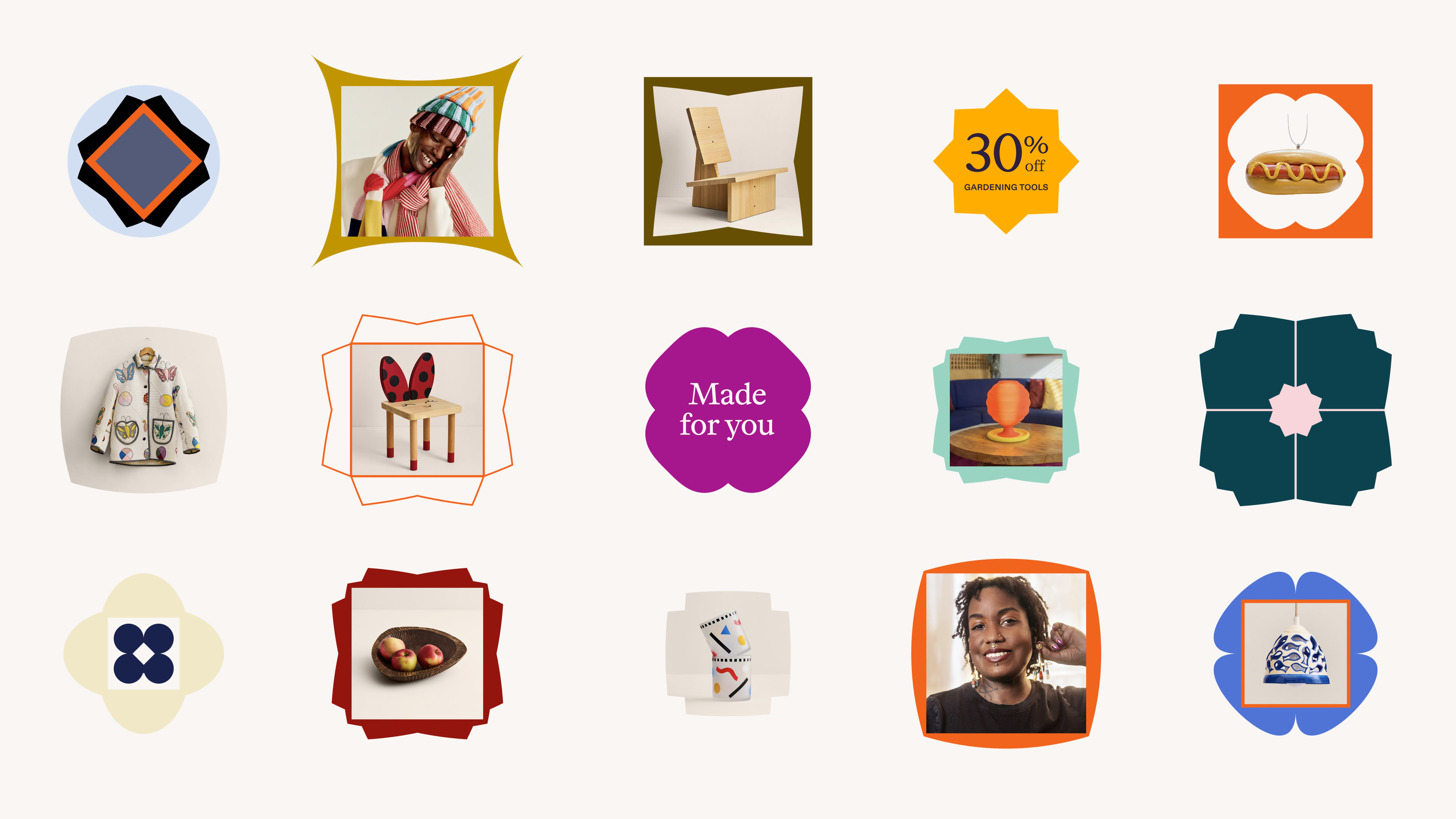
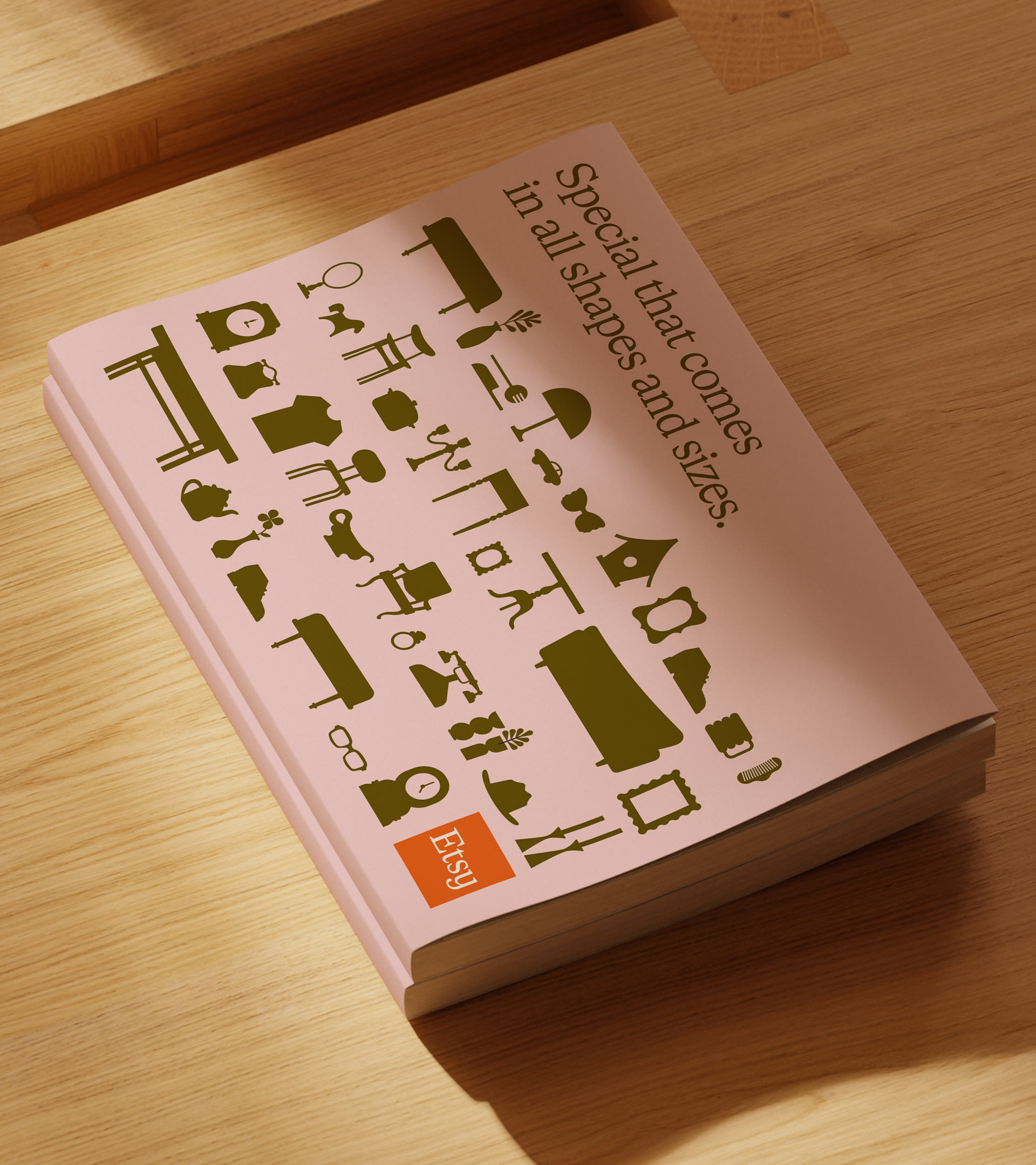
Part of Etsy's appeal is its visual disorder: millions of things made by millions of people with no house style. A design system, by definition, introduces coherence. How do you build a system for a brand whose product is fundamentally the opposite of systematized?
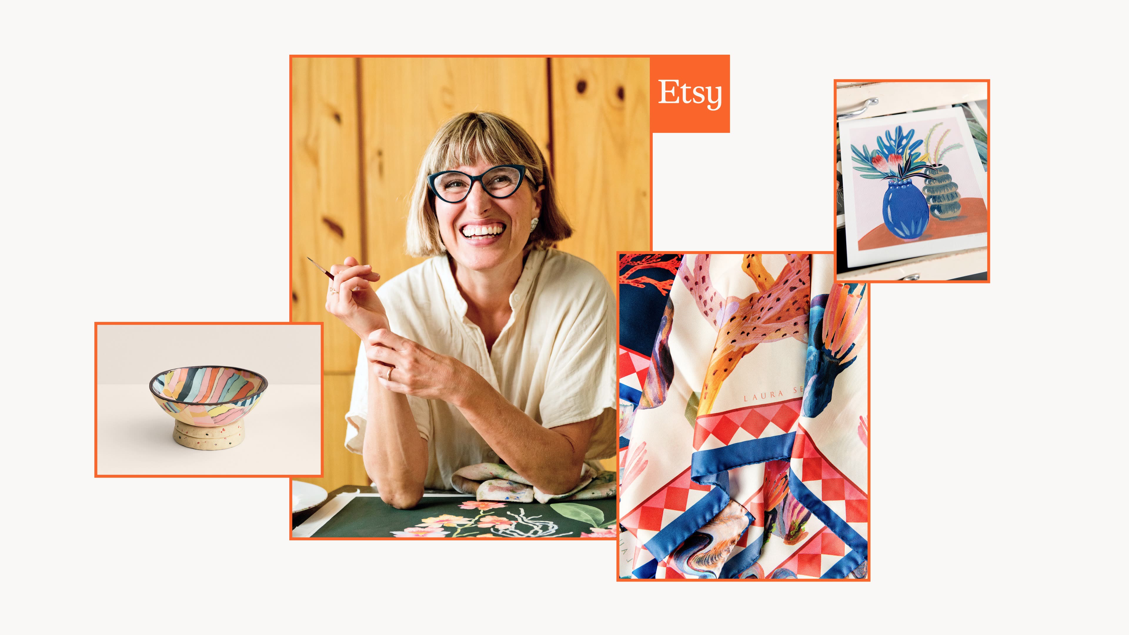
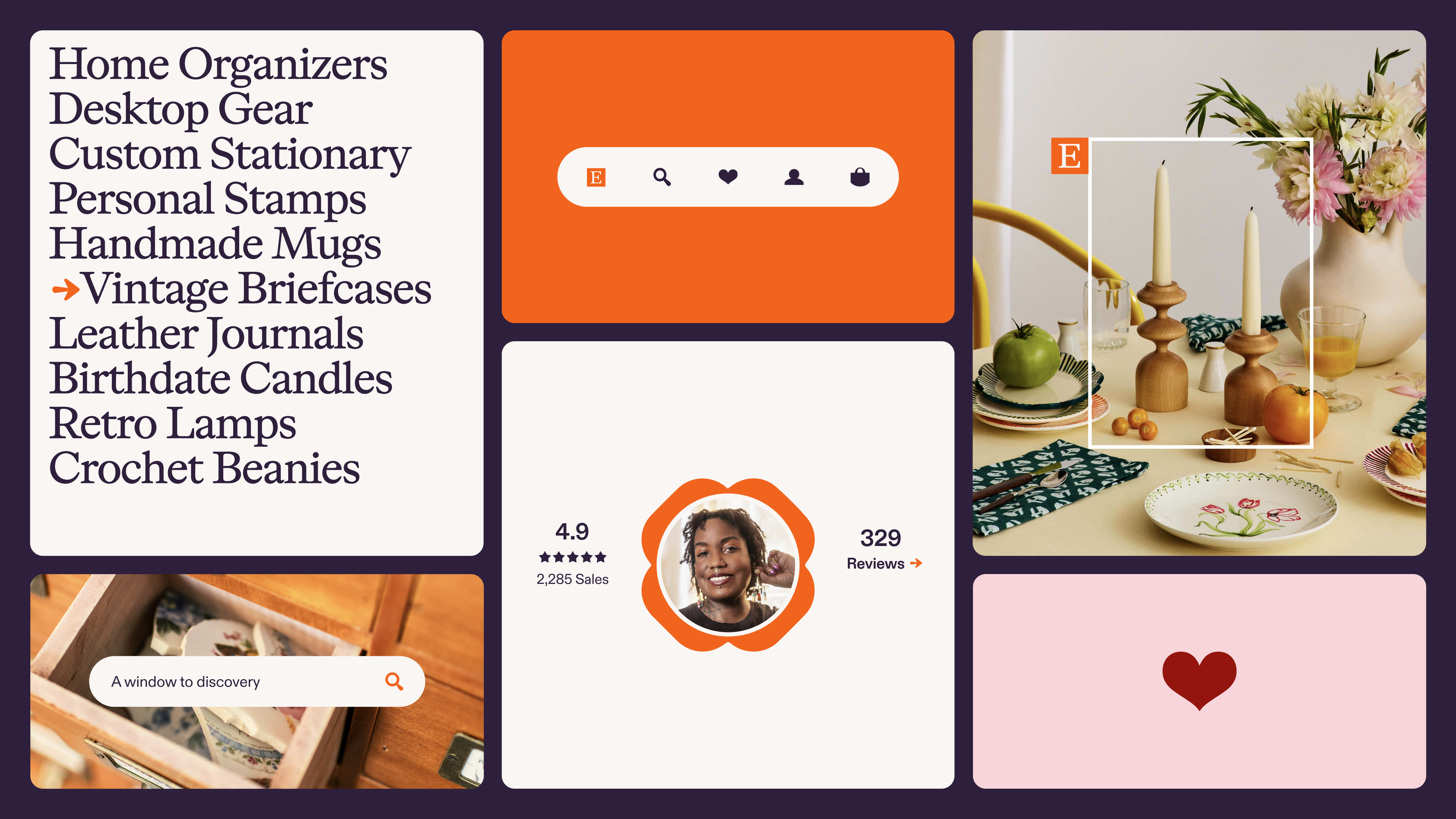
As you suggested, the distinction is in the disorder: One-of-a-kind things need a uniquely responsive and multidimensional home. We pulled inspiration from this idea into core brand behaviors: showcasing variety, featuring humans, diversifying collections, and always creating a sense of ‘opening up’.

Tell us about the verbal identity. What felt like important hallmarks of the brand to keep, and where did the voice flex for this new evolution?
Corey Lewis is a brilliant writer and collaborator on our team that is one of the best at capturing brand voice. With this evolution, we knew as we were pushing on discovery, the brand voice also needed to have a sense of discernment, expertise and knowledge—a guiding presence to help navigate a universe of special.
We defined the character almost as a hospitable host or relatable sommelier—a brand voice that existed to make every experience with Etsy feel special, warm, and approachable. It’s anchored in the brand’s ability to connect the right people with the right items at the right moments.
This approach connected closely with the Etsy brand, which above all else “celebrates being human.” It was especially important in an e-commerce space increasingly devoid of any humanity at all.
Refreshing something people love is its own specific challenge. There's a version of this work that goes wrong by changing too much, and a version that goes wrong by changing too little. How did you and your team calibrate for that, and did you feel that pressure or not?
There was a special chemistry with the team at Etsy. We had friendly, frequent conversations, but were still hard on the work. Between SYLVAIN, Upstatement, and Etsy, we developed this collective conscience that felt intuitive and decisive, making calibration and expectations easier to manage together.
So many branding projects go wrong due to a lack of alignment, objectives or communication—or a distant client relationship altogether. That’s what truly made this one different, special (and successful).
You've said before that you "despise the myth of the lone-wolf savior" and advocate for creative teaming. This was a large, cross-disciplinary project with another agency partner (Upstatement). What's the practical version of that philosophy on a refresh this size? What’s SYLVAIN’S perspective on adding in other agency partners - and when does it feel like the right decision?
SYLVAIN has a common philosophy: “hard on the work, kind to each other.”
There were so many people involved in making this effort real, and that goes far beyond just the branding work. The brief here was to improve the digital product experience for both shoppers and sellers as much as the visual identity, which required our teams to be fully embedded and cross-functional.
SYLVAIN has always had a high bar around the caliber and quality of what we produce. Upstatement is our sister company, so we know the rigor there already exists. With other outside partners, it again goes back to alignment and communication — sharing a creative standard that helps to propel the work forward.
Looking ahead, what are you excited about in the studio or personally? Any new projects or plans on the horizon?
Our design practice continues to grow. We’ve welcomed some new members to the team and have recently released work from brands like Hinge, JPMorgan, Yume, Sage and the Lower East Side Girl’s Club that we’re really proud of. The talent and energy has never been better.
As a Partner at SYLVAIN, Daniel leads the development of the design practice. With experience at both creative agencies and brand consultancies like Mother and Gretel, Daniel's focus lies at bridging the gap between business and expression. He frequently comments on the structures and systems of design, business and strategy across publications, conferences and podcasts.
Daniel Edmundson is no stranger to large, consequential brand work. He’s had stops at Mother and Gretel before landing at SYLVAIN, and he’s even been interviewed by us before. Last time, we talked about how he thinks, how he moves between strategy and design, his allergy to the lone-wolf creative myth, and why Philadelphia suits him better than New York. This time, there's new work to talk about.
SYLVAIN's refreshed brand identity of Etsy dropped earlier this year, and I'll admit, I had a personal stake in this one. I've been an Etsy lover for years, so when I heard they were refreshing the brand, I was paying close attention. Let's get into it.
Etsy has the rare combination of being a big brand and a beloved brand. But with any booming business, you also see quality slip and criticism seep in. What was the impetus for this brand refresh, and what was Etsy hoping to accomplish with it?
Research revealed that people were primarily going to Etsy when they already knew what they wanted, but not to find new things. Where the brand had previously thrived as a destination for discovery, there was now a ubiquitousness around the online shopping experience. It became tougher for Etsy to stand out, even with a superior and more unique product mix.
Our brief was to return the brand to the excitement and energy of its original essence—to make Etsy feel more Etsy.
The work landed on "a starting point for special" — Etsy as a catalyst for discovery and connection, not just a place to transact. How did that idea develop? What were some of the learnings that got you there?
We knew that both Etsy shoppers and sellers were stuck. With ongoing shifts in the space producing a kind of paralysis, we had to create a brand that felt more open, creative, and inviting.
Our strategy and design teams sometimes work in parallel, and this was a moment where we all landed on an idea together. Strategy wanted to define Etsy as a place to provoke action and find inspiration, and the design team pushed to capture the platform’s vast product universe with a visual identity that felt human, energetic, and curious.
The combined strategy and design process is a push and pull, a give and take conversation. Operating with that close sense of collaboration allows for those dialogues to happen and also inform each other’s efforts. When it works, it works really well.
The square became the foundation of the entire system — the logo, the shapes, the motion. How did that come together, and what made it feel like the right structural idea?
The idea of “a starting point for special” needed to come to life in an easily accessible and understandable way. This is my favorite part of creative strategy: connecting the intent with the expression. The square helps to represent that “square one” starting place. But we also wanted to own a square in a world that’s currently obsessed with rounded corners—to find new ways of representing something special in everything from the curvatures in the wordmark’s letterforms to the identity system’s shape language created from that foundation.
In retrospect, the right idea always looks and feels somewhat natural and inevitable. For Etsy, the square foundation allowed for teams to generate and build so much from a solid basis, we knew it was an ideal solve.
Part of Etsy's appeal is its visual disorder: millions of things made by millions of people with no house style. A design system, by definition, introduces coherence. How do you build a system for a brand whose product is fundamentally the opposite of systematized?
As you suggested, the distinction is in the disorder: One-of-a-kind things need a uniquely responsive and multidimensional home. We pulled inspiration from this idea into core brand behaviors: showcasing variety, featuring humans, diversifying collections, and always creating a sense of ‘opening up’.
Tell us about the verbal identity. What felt like important hallmarks of the brand to keep, and where did the voice flex for this new evolution?
Corey Lewis is a brilliant writer and collaborator on our team that is one of the best at capturing brand voice. With this evolution, we knew as we were pushing on discovery, the brand voice also needed to have a sense of discernment, expertise and knowledge—a guiding presence to help navigate a universe of special.
We defined the character almost as a hospitable host or relatable sommelier—a brand voice that existed to make every experience with Etsy feel special, warm, and approachable. It’s anchored in the brand’s ability to connect the right people with the right items at the right moments.
This approach connected closely with the Etsy brand, which above all else “celebrates being human.” It was especially important in an e-commerce space increasingly devoid of any humanity at all.
Refreshing something people love is its own specific challenge. There's a version of this work that goes wrong by changing too much, and a version that goes wrong by changing too little. How did you and your team calibrate for that, and did you feel that pressure or not?
There was a special chemistry with the team at Etsy. We had friendly, frequent conversations, but were still hard on the work. Between SYLVAIN, Upstatement, and Etsy, we developed this collective conscience that felt intuitive and decisive, making calibration and expectations easier to manage together.
So many branding projects go wrong due to a lack of alignment, objectives or communication—or a distant client relationship altogether. That’s what truly made this one different, special (and successful).
You've said before that you "despise the myth of the lone-wolf savior" and advocate for creative teaming. This was a large, cross-disciplinary project with another agency partner (Upstatement). What's the practical version of that philosophy on a refresh this size? What’s SYLVAIN’S perspective on adding in other agency partners - and when does it feel like the right decision?
SYLVAIN has a common philosophy: “hard on the work, kind to each other.”
There were so many people involved in making this effort real, and that goes far beyond just the branding work. The brief here was to improve the digital product experience for both shoppers and sellers as much as the visual identity, which required our teams to be fully embedded and cross-functional.
SYLVAIN has always had a high bar around the caliber and quality of what we produce. Upstatement is our sister company, so we know the rigor there already exists. With other outside partners, it again goes back to alignment and communication — sharing a creative standard that helps to propel the work forward.
Looking ahead, what are you excited about in the studio or personally? Any new projects or plans on the horizon?
Our design practice continues to grow. We’ve welcomed some new members to the team and have recently released work from brands like Hinge, JPMorgan, Yume, Sage and the Lower East Side Girl’s Club that we’re really proud of. The talent and energy has never been better.
As a Partner at SYLVAIN, Daniel leads the development of the design practice. With experience at both creative agencies and brand consultancies like Mother and Gretel, Daniel's focus lies at bridging the gap between business and expression. He frequently comments on the structures and systems of design, business and strategy across publications, conferences and podcasts.