Let’s talk about the Murphy bed. When most people think of Murphy beds, they probably picture old-timey slapstick comedy. Cue Charlie Chaplin…
But the Murphy bed is much more than a punchline. It’s an invention born out of necessity and a dash of romance. The story goes that the inventor, William Lawrence Murphy, was in love with the opera singer Gladys Kaighin. His love drove him to invent the fold-out bed in his one-room San Francisco apartment. The reason? Dating conventions in the early 1900s frowned upon inviting a lady into a gentleman’s sleeping quarters.
Murphy’s solution transformed his bedroom into an entertaining space, solving his immediate space issue and paving the way for his romantic pursuits. Fast forward to the end of the story: William and Gladys got hitched!
That story is over a hundred years old. And yet here I am, still reaching for it to explain something happening right now. Good ideas have a long shelf life. The ones worth borrowing usually have a little dust on them.
The Murphy Concept
So, what does the Murphy bed have to do with design? Beyond the obvious ingenious design of the bed itself, the Murphy bed is a potent metaphor.
The Murphy bed encapsulates everything we aim for when building a compelling user interface: it’s functional yet discreet, it makes excellent use of limited space in a playful way, and it offers an intuitive, seamless experience. Think dropdown menus, collapsible keyboards, and app-switching UI.
Metaphors provide the foundation for conceptualizing abstract concepts and making them sticky in people’s minds. In the design world, they help teams build a shared language, give stakeholders something to hold onto, and make critique feel like collaboration instead of combat. When wielded effectively, the right metaphor gives everyone in the room the same North Star. Hence, “The Murphy Concept.” Here are a few examples of what that looks like in practice.
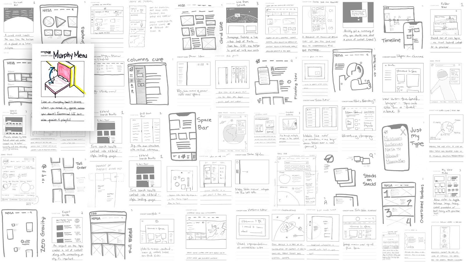
The NASA.gov Murphy Menu
Consider Blink UX’s redesign of NASA.gov. NASA needed to build a unified web experience that would help inspire the next generation of scientists. They had over 3,000 major websites that housed important scientific information for scientists, students, educators, parents, science enthusiasts, and government officials… so a lot of content.
The goal was to make all of that content easy to find and navigate. No small task.
As part of the design team at Blink, we explored and tested a variety of UI concepts and patterns. We ultimately aligned on a mega menu direction, code-named "the Murphy Menu," to organize all of NASA’s information. Just like the bed, the menu is there when you need it, full of informative and immersive content, then seamlessly tucks away, allowing users to explore without clutter or confusion.
By applying the principles of the Murphy bed, we arrived at an elegant solution to a genuinely complex problem. Turns out the same logic that helped William Murphy impress an opera singer works pretty well for organizing humanity’s scientific legacy too.
The DialPak
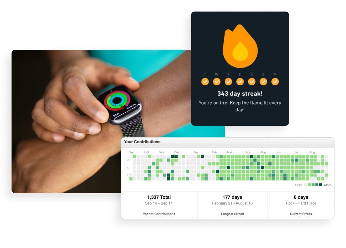
There’s a small plastic disc sitting in the Smithsonian that might be the most quietly influential piece of UX design ever made. Introduced in 1963, the DialPak was the first oral contraceptive package designed with a built-in memory aid. A rotating dial tracked the day, surfaced the next pill, and made progress visible in your hand. A habit engine. A streak interaction sixty years before Duolingo. The logic of it anchors behavior to time, makes progress visible, and makes a meaningful goal feel achievable one small step at a time. That logic is the foundation of every habit-forming digital product we design today.
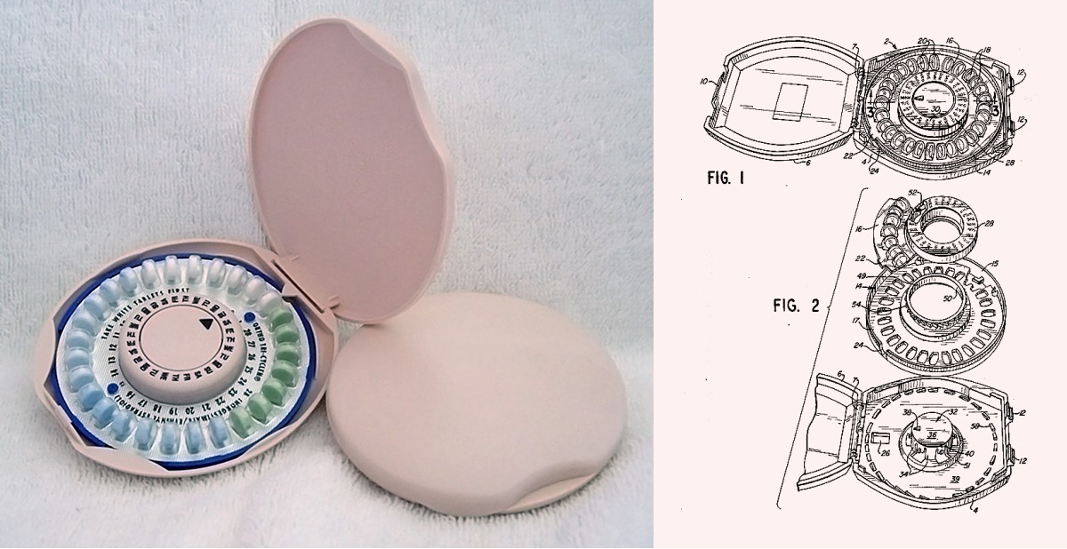
At Blink, we spend a lot of time thinking about exactly this. Working on EdTech platforms like Cisco U, Microsoft Learn, and Lumen Learning, one of our core design challenges is building genuine learning habits, the kind that stick, compound, and actually change people. Our designer Sofia Cababa Wood was deep in an inspirational audit, collecting contemporary and historical ways humans have visualized time, progress, and ritual, when she came across the DialPak. Its circular form and elegant use of the dial to mark time and track progress directly informed the visual direction we were exploring. Both metaphor and blueprint. A product built around the idea that a person deserves a tool that remembers with them, makes a meaningful goal feel manageable one day at a time, and puts autonomy, independence, and self-guided progress within reach.

This is exactly the kind of archival inspiration that elevates a design project from good to unforgettable. A 60-year-old plastic disc, designed with profound intentionality for women’s health and independence, quietly unlocking a visual and philosophical direction for how millions of people learn today. Designing for a small daily habit feels humble on the surface. One pill. One lesson. One ring closed. But a well-designed daily ritual, multiplied across millions of people over years, is genuinely world-changing. The DialPak helped individual women manage their health and in doing so reshaped society. Those are the stakes hiding inside every habit-forming product we build, and a potent metaphor from the archive is one of the best ways to stay connected to what you’re actually building toward.
The Sidecar Motorcycle
The Murphy bed and the DialPak are both concrete design solutions, objects that solved specific problems so elegantly that their logic still applies today. But archival metaphors can do something else too. Sometimes an old object is the best tool for wrapping your head around a shift so big and so fast that the present hasn’t yet found language for it. Which brings me to the sidecar motorcycle.

We are living in a liminal moment in the digital product world. The power of Agentic and generative AI is here, and yet most everyday users struggle to find a coherent way in. The mental models of today’s apps and interfaces don’t yet speak the language of AI, leaving a gap between what the technology can do and what people actually experience.
The sidecar motorcycle is old, charming, and a little ridiculous. But it might be the most honest artifact from our past to describe where we are right now. It expands the motorcycle without replacing it. As the rider, you still steer, still decide, still own the journey. But with the sidecar attached, you can go further, carry more, and bring someone along. That’s the AI opportunity for everyday users in a nutshell. You’re still you, still the one deciding where to go, what to make, what to ask. AI doesn’t take the handlebars.

Nobody buys a sidecar because it’s the fastest way to get somewhere. You buy one because the ride itself is the reward. That’s exactly the mindset that unlocks AI for most people: curiosity over efficiency or automation, the willingness to hop on something a little wobbly and see where it takes you. The prompting, the experimenting, the unexpectedly wonderful detour you didn’t plan for. That’s the invitation hiding inside every AI product we build.
More Than Just Metaphors
The Murphy bed, the DialPak, the sidecar motorcycle. Three objects from the past, each one a window into something designers are still wrestling with today: how to make complex systems feel human, how to build habits that actually stick, how to invite people into technology without leaving them behind.
That’s what a good metaphor does. It gives a whole team something to hold onto, keeps the work connected to human experiences, and orients critique around a shared idea rather than competing opinions. And the best ones carry emotional weight too! Romance in the Murphy bed. Empowerment in the DialPak. Curiosity in the sidecar. That’s the stuff that makes a project memorable long after the Figma file is archived.
So next time you’re stuck, go digging. Old catalogs, museum archives, your grandmother’s kitchen drawer. The object that unlocks your next project might already exist. It’s just waiting to be recognized.
About Ben:
Ben Shown is Head of Design at Blink UX, where he helps ambitious partners like Amazon, Expedia, Microsoft, NASA, and The New York Times create their next breakthrough. Beyond agency work, he corrupts young design minds as a part-time lecturer at Northeastern University, spreading infectious enthusiasm for making digital products less frustrating and more equitable. And if given the chance, he’ll gladly talk to you about design workshops, typography, and Murphy beds.
Let’s talk about the Murphy bed. When most people think of Murphy beds, they probably picture old-timey slapstick comedy. Cue Charlie Chaplin…
But the Murphy bed is much more than a punchline. It’s an invention born out of necessity and a dash of romance. The story goes that the inventor, William Lawrence Murphy, was in love with the opera singer Gladys Kaighin. His love drove him to invent the fold-out bed in his one-room San Francisco apartment. The reason? Dating conventions in the early 1900s frowned upon inviting a lady into a gentleman’s sleeping quarters.
Murphy’s solution transformed his bedroom into an entertaining space, solving his immediate space issue and paving the way for his romantic pursuits. Fast forward to the end of the story: William and Gladys got hitched!
That story is over a hundred years old. And yet here I am, still reaching for it to explain something happening right now. Good ideas have a long shelf life. The ones worth borrowing usually have a little dust on them.
The Murphy Concept
So, what does the Murphy bed have to do with design? Beyond the obvious ingenious design of the bed itself, the Murphy bed is a potent metaphor.
The Murphy bed encapsulates everything we aim for when building a compelling user interface: it’s functional yet discreet, it makes excellent use of limited space in a playful way, and it offers an intuitive, seamless experience. Think dropdown menus, collapsible keyboards, and app-switching UI.
Metaphors provide the foundation for conceptualizing abstract concepts and making them sticky in people’s minds. In the design world, they help teams build a shared language, give stakeholders something to hold onto, and make critique feel like collaboration instead of combat. When wielded effectively, the right metaphor gives everyone in the room the same North Star. Hence, “The Murphy Concept.” Here are a few examples of what that looks like in practice.
The NASA.gov Murphy Menu
Consider Blink UX’s redesign of NASA.gov. NASA needed to build a unified web experience that would help inspire the next generation of scientists. They had over 3,000 major websites that housed important scientific information for scientists, students, educators, parents, science enthusiasts, and government officials… so a lot of content.
The goal was to make all of that content easy to find and navigate. No small task.
As part of the design team at Blink, we explored and tested a variety of UI concepts and patterns. We ultimately aligned on a mega menu direction, code-named "the Murphy Menu," to organize all of NASA’s information. Just like the bed, the menu is there when you need it, full of informative and immersive content, then seamlessly tucks away, allowing users to explore without clutter or confusion.
By applying the principles of the Murphy bed, we arrived at an elegant solution to a genuinely complex problem. Turns out the same logic that helped William Murphy impress an opera singer works pretty well for organizing humanity’s scientific legacy too.
The DialPak
There’s a small plastic disc sitting in the Smithsonian that might be the most quietly influential piece of UX design ever made. Introduced in 1963, the DialPak was the first oral contraceptive package designed with a built-in memory aid. A rotating dial tracked the day, surfaced the next pill, and made progress visible in your hand. A habit engine. A streak interaction sixty years before Duolingo. The logic of it anchors behavior to time, makes progress visible, and makes a meaningful goal feel achievable one small step at a time. That logic is the foundation of every habit-forming digital product we design today.
At Blink, we spend a lot of time thinking about exactly this. Working on EdTech platforms like Cisco U, Microsoft Learn, and Lumen Learning, one of our core design challenges is building genuine learning habits, the kind that stick, compound, and actually change people. Our designer Sofia Cababa Wood was deep in an inspirational audit, collecting contemporary and historical ways humans have visualized time, progress, and ritual, when she came across the DialPak. Its circular form and elegant use of the dial to mark time and track progress directly informed the visual direction we were exploring. Both metaphor and blueprint. A product built around the idea that a person deserves a tool that remembers with them, makes a meaningful goal feel manageable one day at a time, and puts autonomy, independence, and self-guided progress within reach.
This is exactly the kind of archival inspiration that elevates a design project from good to unforgettable. A 60-year-old plastic disc, designed with profound intentionality for women’s health and independence, quietly unlocking a visual and philosophical direction for how millions of people learn today. Designing for a small daily habit feels humble on the surface. One pill. One lesson. One ring closed. But a well-designed daily ritual, multiplied across millions of people over years, is genuinely world-changing. The DialPak helped individual women manage their health and in doing so reshaped society. Those are the stakes hiding inside every habit-forming product we build, and a potent metaphor from the archive is one of the best ways to stay connected to what you’re actually building toward.
The Sidecar Motorcycle
The Murphy bed and the DialPak are both concrete design solutions, objects that solved specific problems so elegantly that their logic still applies today. But archival metaphors can do something else too. Sometimes an old object is the best tool for wrapping your head around a shift so big and so fast that the present hasn’t yet found language for it. Which brings me to the sidecar motorcycle.
We are living in a liminal moment in the digital product world. The power of Agentic and generative AI is here, and yet most everyday users struggle to find a coherent way in. The mental models of today’s apps and interfaces don’t yet speak the language of AI, leaving a gap between what the technology can do and what people actually experience.
The sidecar motorcycle is old, charming, and a little ridiculous. But it might be the most honest artifact from our past to describe where we are right now. It expands the motorcycle without replacing it. As the rider, you still steer, still decide, still own the journey. But with the sidecar attached, you can go further, carry more, and bring someone along. That’s the AI opportunity for everyday users in a nutshell. You’re still you, still the one deciding where to go, what to make, what to ask. AI doesn’t take the handlebars.
Nobody buys a sidecar because it’s the fastest way to get somewhere. You buy one because the ride itself is the reward. That’s exactly the mindset that unlocks AI for most people: curiosity over efficiency or automation, the willingness to hop on something a little wobbly and see where it takes you. The prompting, the experimenting, the unexpectedly wonderful detour you didn’t plan for. That’s the invitation hiding inside every AI product we build.
More Than Just Metaphors
The Murphy bed, the DialPak, the sidecar motorcycle. Three objects from the past, each one a window into something designers are still wrestling with today: how to make complex systems feel human, how to build habits that actually stick, how to invite people into technology without leaving them behind.
That’s what a good metaphor does. It gives a whole team something to hold onto, keeps the work connected to human experiences, and orients critique around a shared idea rather than competing opinions. And the best ones carry emotional weight too! Romance in the Murphy bed. Empowerment in the DialPak. Curiosity in the sidecar. That’s the stuff that makes a project memorable long after the Figma file is archived.
So next time you’re stuck, go digging. Old catalogs, museum archives, your grandmother’s kitchen drawer. The object that unlocks your next project might already exist. It’s just waiting to be recognized.
About Ben:
Ben Shown is Head of Design at Blink UX, where he helps ambitious partners like Amazon, Expedia, Microsoft, NASA, and The New York Times create their next breakthrough. Beyond agency work, he corrupts young design minds as a part-time lecturer at Northeastern University, spreading infectious enthusiasm for making digital products less frustrating and more equitable. And if given the chance, he’ll gladly talk to you about design workshops, typography, and Murphy beds.